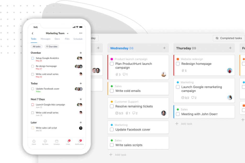
Looking to supercharge your productivity? Well then, don’t miss out on the battle of these two productivity titans: TickTick vs Todoist!!!
Both claim to be the ultimate solution for managing tasks, boosting efficiency, and staying organized. But which app truly takes the crown?
In this epic showdown, we’ll dive into a head-to-head comparison, exploring their features, pricing, and unique offerings.
So, let’s get started!
TickTick vs Todoist: Overview
1. Cross-platform availability and synchronization
Below is the side-by-side comparison table of TickTick and Todoist cross-platform capabilities.
| Platform | TickTick | Todoist |
|---|---|---|
| Web Version | ✅ | ✅ |
| Linux | ✅ | ✅ |
| Windows | ✅ | ✅ |
| Mac | ✅ | ✅ |
| iOS | ✅ | ✅ |
| Android | ✅ | ✅ |
| Apple Watch | ✅ | ✅ |
| Android Smartwatches | ❌ | ✅ |
| Gmail Extension | ✅ | ✅ |
| Outlook Extension | ✅ | ✅ |
As you see, both TickTick and Todoist provide broad cross-platform availability.
They allow you to sync seamlessly and manage your tasks on multiple devices, whether your computer, smartphone, or smartwatch.
The only big difference is Todoist supports smartwatches with an Android operation system, while TickTick doesn’t.
2. User interface and ease of use
A. Design Approach
TickTick and Todoist have distinct design approaches that set them apart visually.
TickTick embraces a minimalist theme with subdued colors, while Todoist takes a more playful approach with its default red color and vibrant interface.
B. Layout
Todoist and TickTick follow a similar layout in their user interface.
On desktop computers and tablets, both apps display tasks on the right side. The left sidebar, meanwhile, showcases lists and tags in TickTick and Projects and Labels in Todoist for organizing tasks effectively.

Annotation: TickTick’s layout
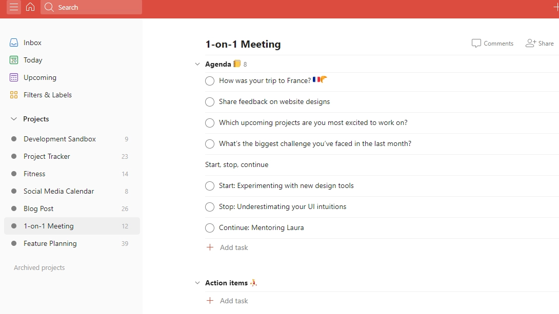
Annotation: Todoist’s layout
This layout style remains consistent in mobile apps as well.
C. Customization
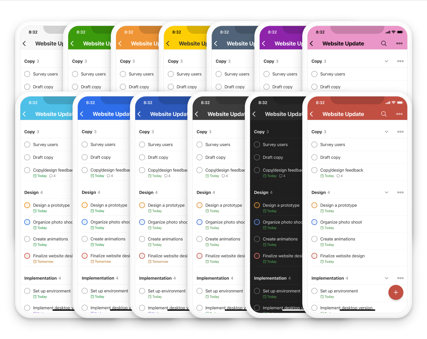
Todoist offers users the ability to choose from 13 theme options.
Meanwhile, TickTick goes further by providing 25+ themes and even an option to add a custom image.
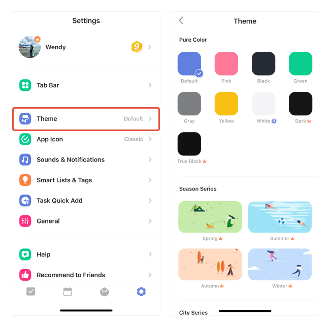
So, TickTick gives users greater flexibility in tailoring the app’s appearance to their liking.
TickTick vs Todoist: An In-Depth Comparison
I. TickTick vs Todoist: Hierarchical structure
Both apps allow you to create folders to organize projects better. With those projects with multiple phases, you can break them down into sections, then add new tasks and subtasks – if needed.
In summary, here is the hierarchical structure of each app:
TickTick: Folders – Lists – Sections – Tasks – Sub-tasks
Todoist: Folders – Sub-folders – Projects – Sections – Tasks – Sub-tasks
Note: Todoist offers up to two sub-folders per folder.
II. TickTick vs Todoist: Feature Comparison
A. Task creation and organization
1. Task creation
Both TickTick and Todoist make it simple to add a new task across devices.
They both offer intuitive and efficient options, with slight variations in terminology and features.
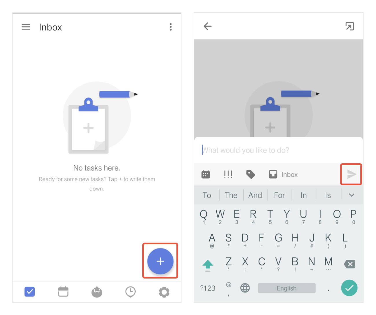
TickTick welcomes you with a Plus (+) button, ready to kickstart your task creation journey.
On the other hand, Todoist opts for an “Add task” button.
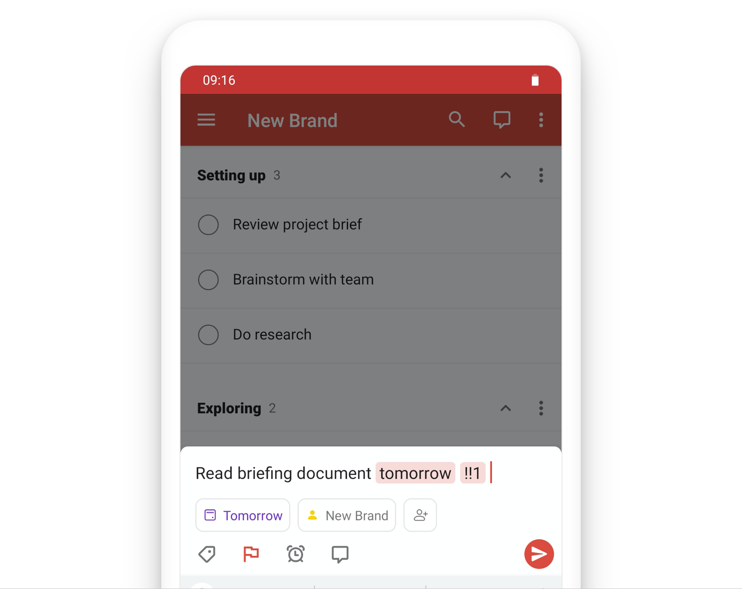
If you use Todoist’s browser or desktop version, another way to add tasks is by using the shortcut “Q”.
But the best part is, both apps have your back with their natural language processing superpowers.
Imagine this:
You’re on TickTick and type “tomorrow night” or “remind” followed by a specific time and date. Bam!
TickTick’s magical algorithms automatically set the due date or create a reminder with a specific date for you.
Oh, and here’s a pro tip:
Using shorthand like “tom” or “tod” for tomorrow and today works like a charm, as long as you add a time reference.

Todoist is no slacker, either!
Just mention dates, times, or keywords like “remind” or “reminder,” and watch as Todoist works magic.
It even recognizes “tom” and “tod” for tomorrow and today without specifying a time. How convenient is that?
2. Task organization
Defaulted task organization options
When it comes to task organization, TickTick and Todoist have some common ground. They provide:
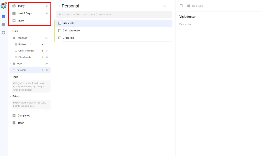
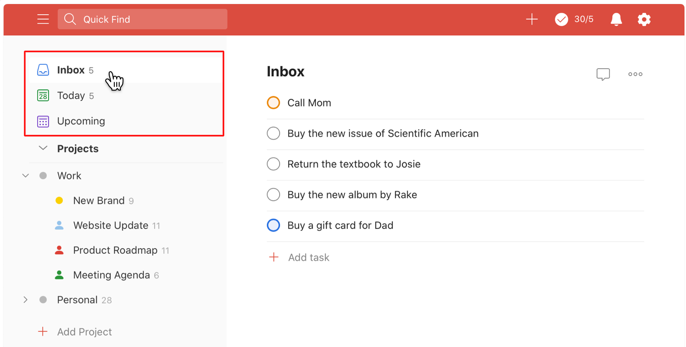
Inbox view – where you can throw in tasks without any specific deadlines.
Today view – which shows you the to-do list due today.
Upcoming view (Todoist) – which shows you the do-to list due in the future.
Next 7 Days view (TickTick) – which shows you the to-do list due in the upcoming week.
App categorization options
Even the ways these two task management apps categorize and classify tasks are similar, just with slight variations in terminology.
TickTick allows you to create different lists, like personal or work, to sort tasks based on their nature.
If you want to further classify tasks with precision, TickTick provides you with tags, acting as sub-categories within lists.
Here are four ways to add tags to a task:
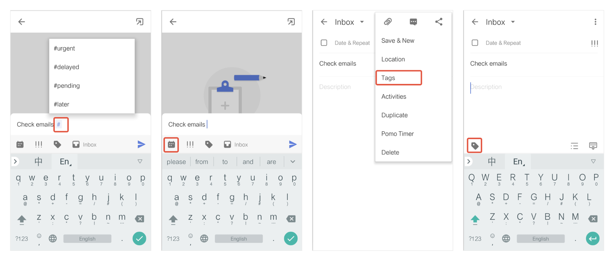
You also can add a splash of color to your tags, making it even easier to identify and distinguish tasks at a glance.
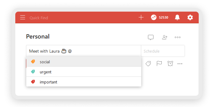
Todoist does the same way. But instead of “Lists”, it names “Projects”. Instead of “Tags”, it names “Labels”.
Task details
Both task management apps arguably provide various tools to keep tasks in check.
They allow you to attach files, add notes, create subtasks, and leave comments.
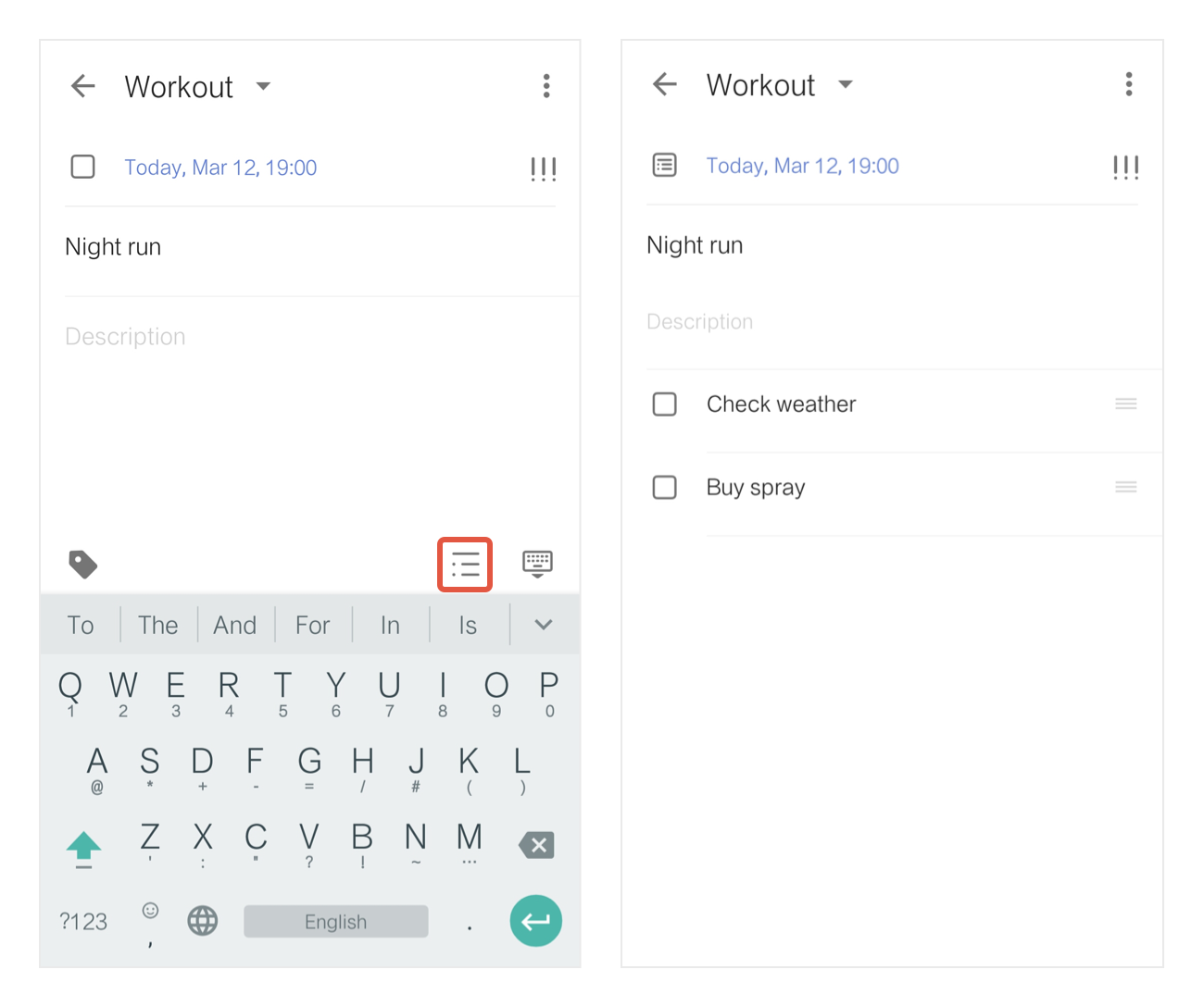
Annotation: How to create subtasks in TickTick.
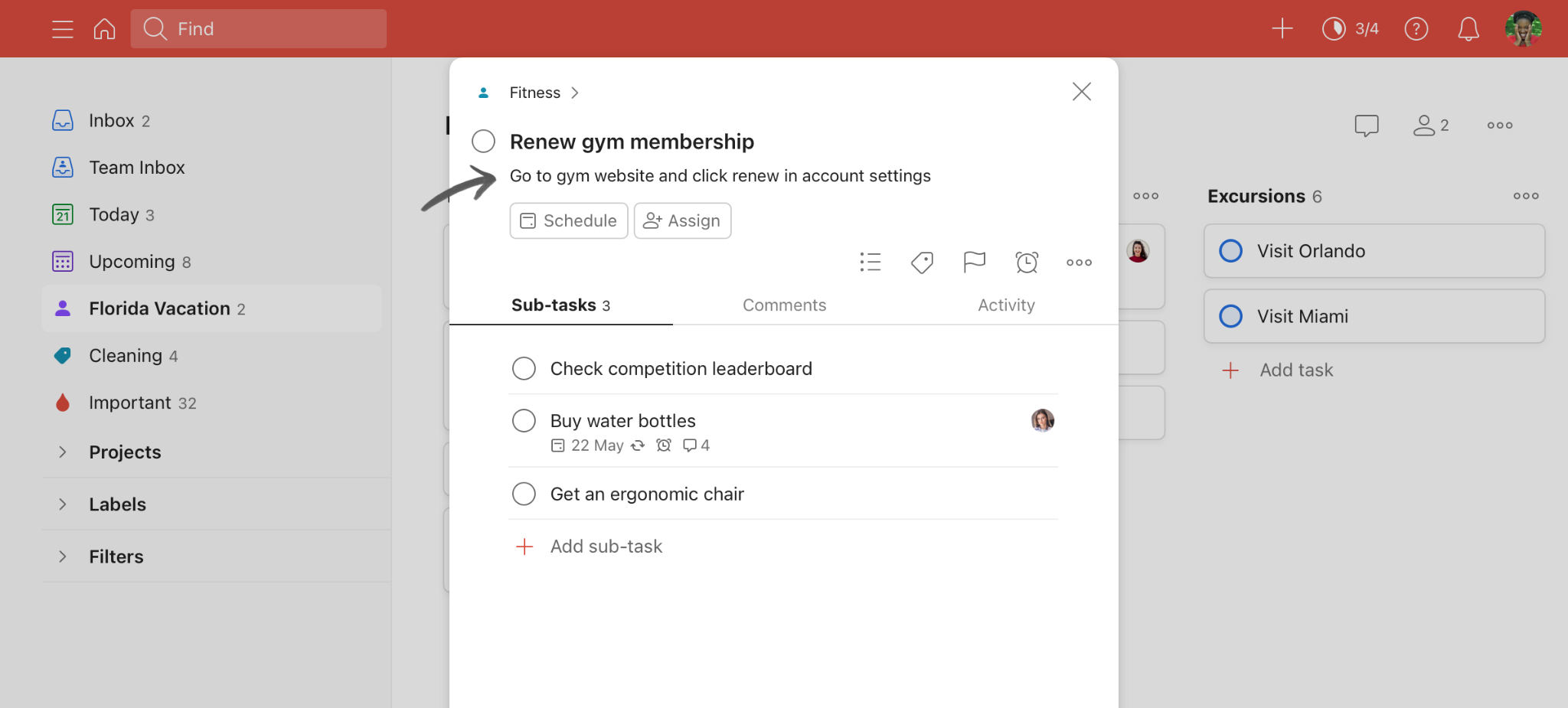
Annotation: How to add notes to a task in Todoist.
Task reminders
One of the differences between TickTick and Todoist is the location-based reminder.
Although both task management apps offer this feature, Todoist’s location-based reminders are available on all platforms, including Windows and macOS, unlike TickTick’s mobile-exclusive feature.
To summarize the comparison:
|
TickTick |
Todoist | |
|---|---|---|
|
Ways to create a new task |
-Using the Plus (+) button |
-Using the “Add task” button -Using the shortcut “Q” |
|
Natural language processing? |
✅ |
✅ |
|
Number of task organization options |
Four defaulted options: -“Inbox” -“Today“ -“Upcoming” -“Next 7 Days” |
Four defaulted options: -“Inbox” -“Today“ -“Upcoming” -“Next 7 Days” |
|
Ways to categorize tasks |
Lists & color-coded Tags |
Projects & color-coded Labels |
|
Location-based reminders? |
✅(mobile apps only) |
✅ (all platforms) |
B. Task prioritization
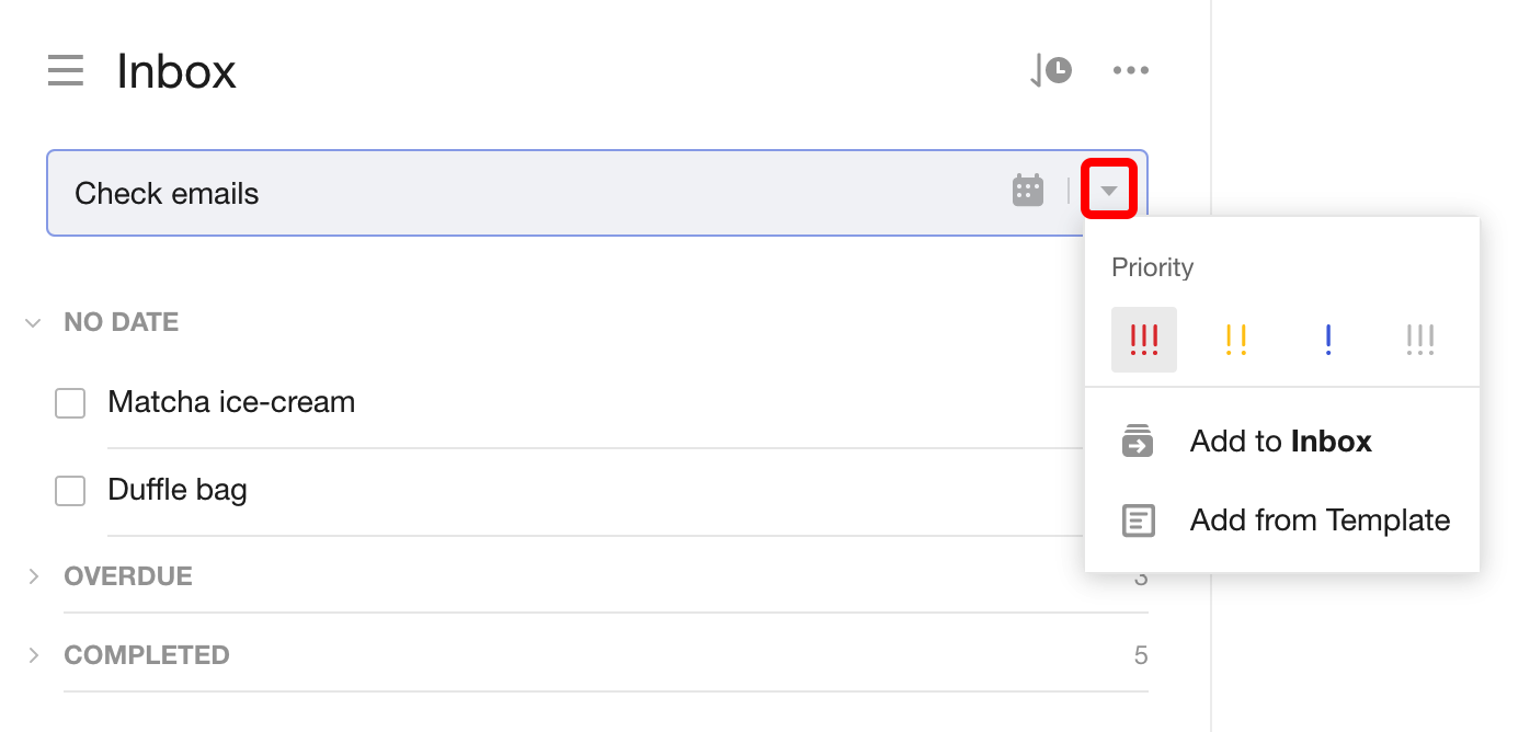
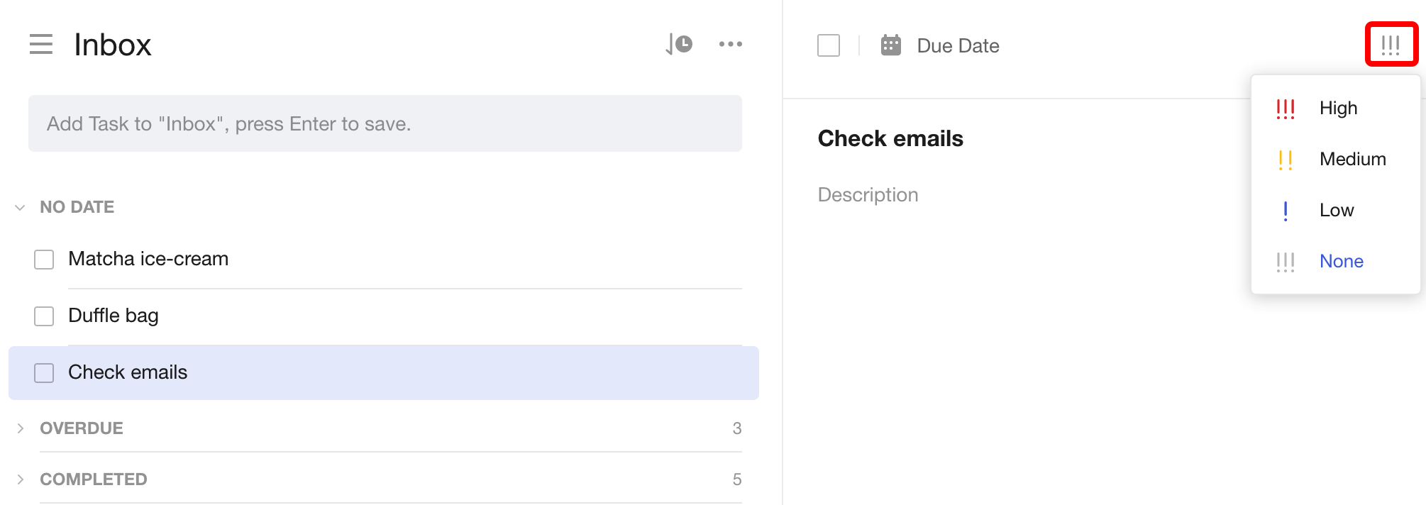
Regarding task prioritization, both task management apps use the same approach: color codes. Four defaulted color-code options, to be exact.
In TickTick, you’ll choose the desired color code from the Quick Add Bar.
Or from the priority button sitting in the top right corner of the task detail view.
In Todoist, click or tap the flag icon within the task, then select the desired priority level.
C. Due dates & recurring tasks
1. Due dates and times
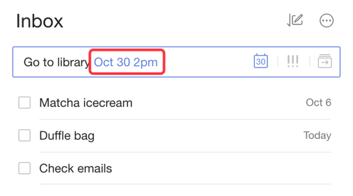
It’s very easy to add a task’s due date in both TickTick and Todoist.
With TickTick, type the due date when creating a new task, or click the calendar icon within a task.
Todoist, on the other hand, takes it to the next level.
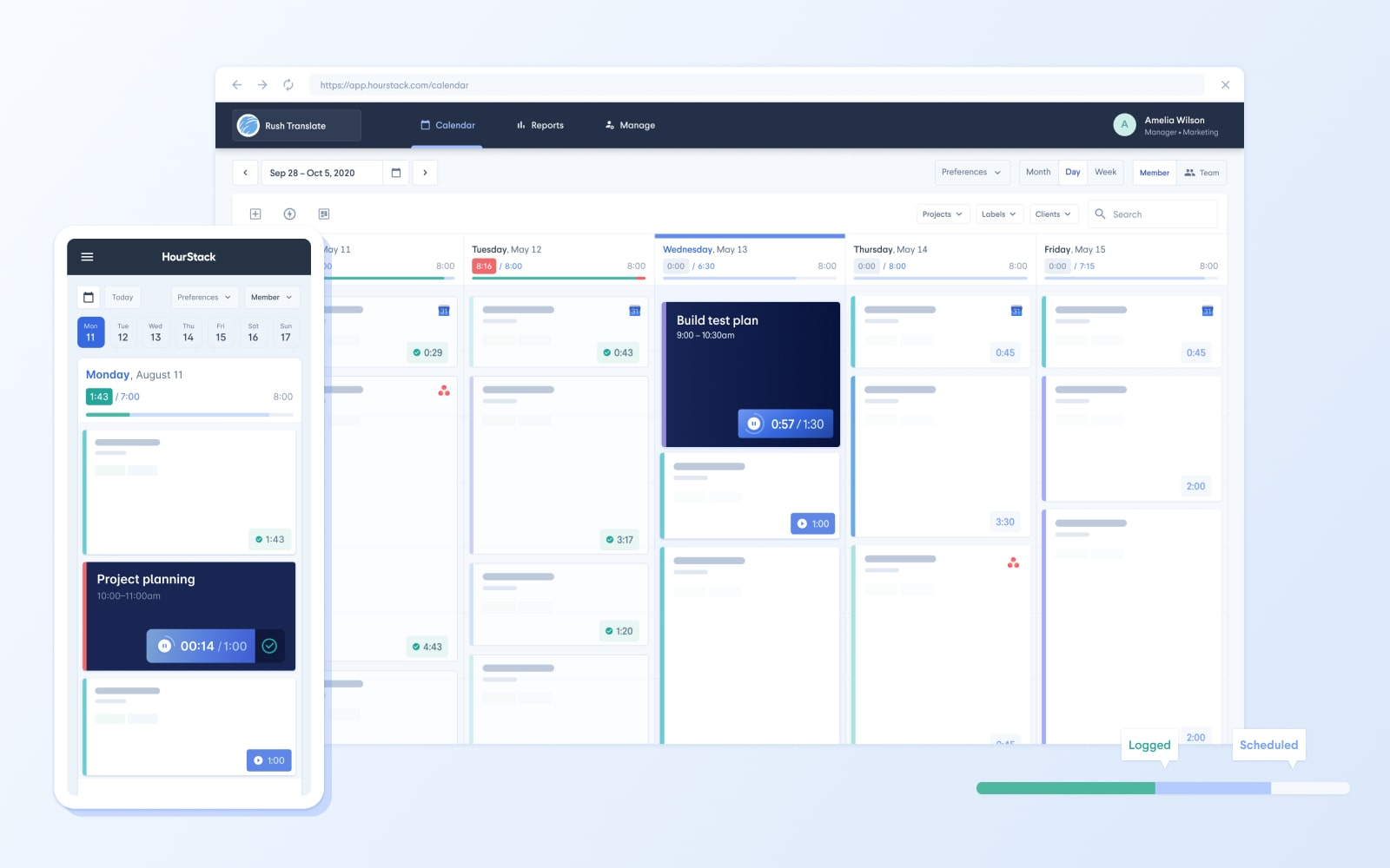
Not only does the app offer due dates but also start and due times.
For quickly adding a task’s due date, you can use the natural language input feature – similar to TickTick.
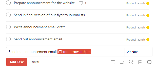
To add the start and due time to tasks, connect Todoist with HourStack, then create time blocks.
2. Recurring tasks
You can set recurring tasks in TickTick and Todoist.
TickTick focuses on the flexibility of customization.
You can easily create a task and designate it as recurrent by tapping on the task’s time or date.
From there, you can navigate to the Repeat option and select the desired repeat cycle that suits your task.
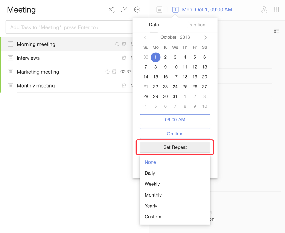
If none of the pre-defined options fit your requirements, TickTick allows you to customize how your task will repeat.
You can choose between basing the recurrence on a fixed time interval or the completion of the last recurrence.
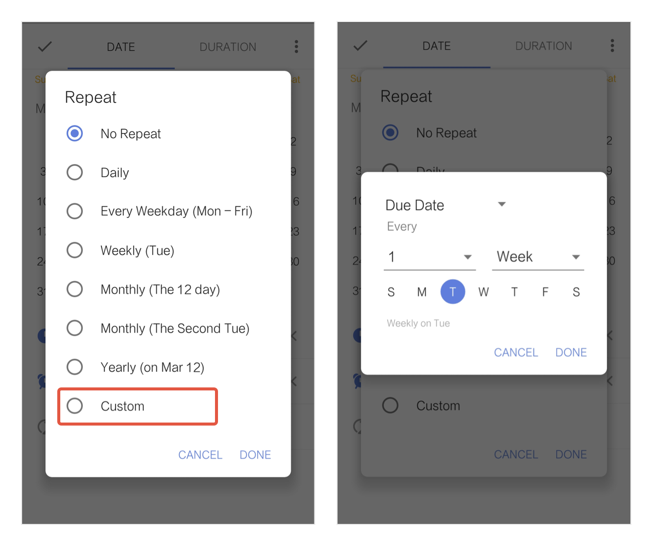
This flexibility empowers you to define the frequencies that best align with your routines and commitments.
On the other hand, Todoist adopts a due date-centric strategy.
To set a recurring task in Todoist, you can assign a due date with both a start and end date.
For example, you can type “every day starting May 3 and ending May 6” to create a task that repeats daily within the specified timeframe. When you complete the task, it will reset for the following days accordingly.
Todoist also offers the option to set open-ended recurring due dates, such as “every day starting from Tue Sep 1 to Forever.”
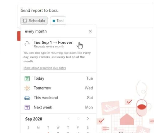
Once you finish the task, you can select “Complete forever” from the task options menu, removing it from your active task lists.
This approach allows you to establish recurring tasks with specific start and end dates or create open-ended tasks that continue indefinitely until marked as complete.
D. Collaboration & Team Management
Although TickTick and Todoist are to-do list apps, they provide basic team collaboration features.
1. TickTick
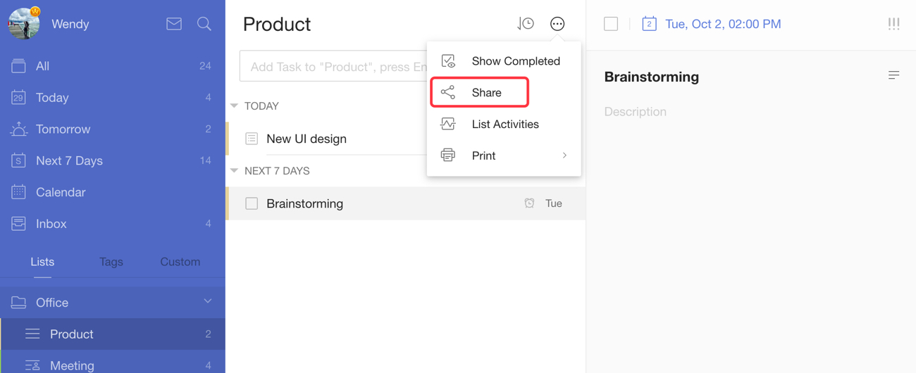
You can easily share your Lists with others through a simple link.
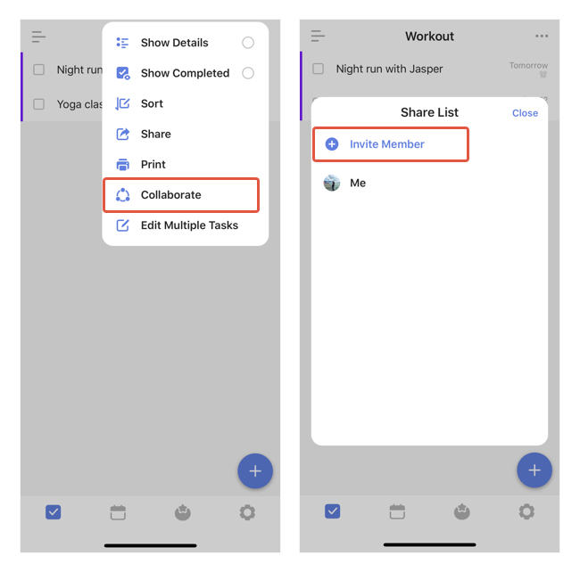
Or, invite others into your lists.
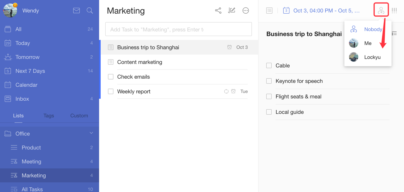
Once done, you can assign tasks to specific individuals by selecting them as Assignees. This way, everyone knows their responsibilities and can work together efficiently.
The to-do list app also keeps you updated on task activities, highlighting when tasks were created and modified and by whom.
2. Todoist
The Todoist app allows users to share Projects or join Projects when invited by others.
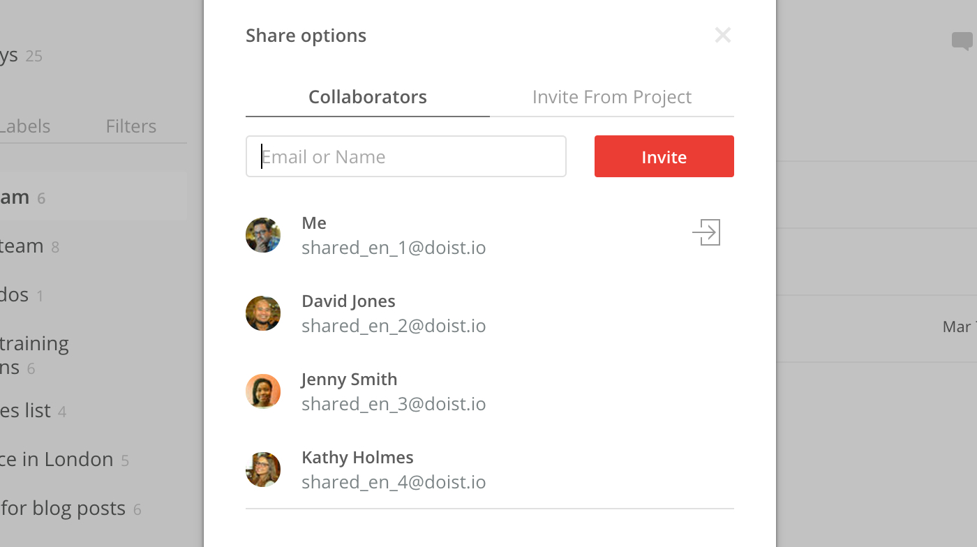
By sharing a Project, you enable your team members to access and contribute to its tasks and subtasks.
When creating tasks within a Project, you can easily assign them to specific team members, complete with due dates and optional reminders.
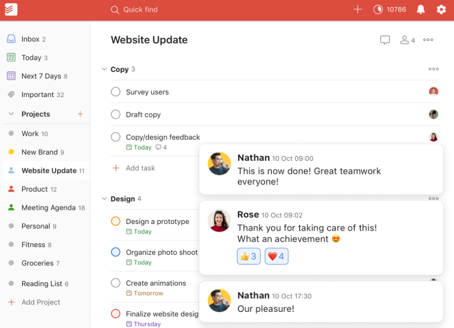
It’s worth noting that Todoist allows up to 25 guests per Project for those with a Pro subscription, allowing for larger-scale collaborations and team management.
E. Project views options
1. List view
List views in both TickTick and Todoist adopt a simple and intuitive approach.
This gives you a quick and organized overview of your tasks, functioning like a vertical timeline to boost your productivity.
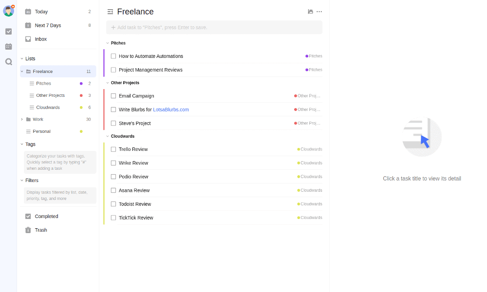
Annotation: TickTick’s list view.
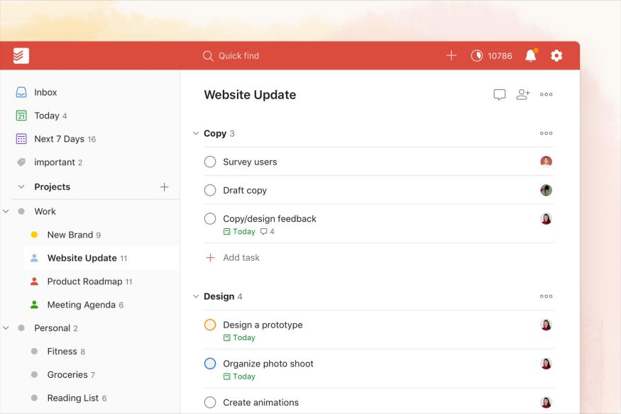
Annotation: Todoist’s list view.
2. Kanban board view
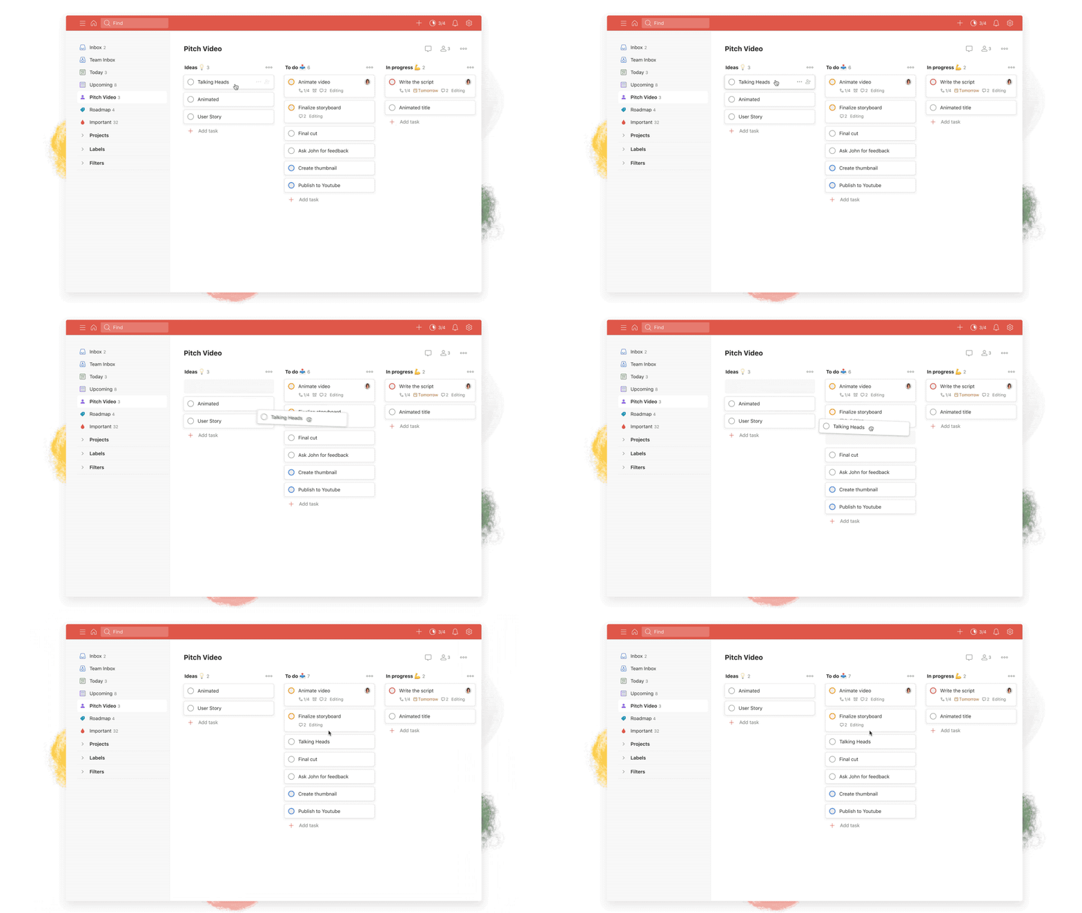
Speaking of Kanban boards, both apps share similarities in sorting, displaying completed tasks, and moving items horizontally.
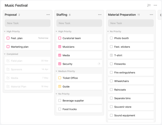
Annotation: TickTick’s board view.

Annotation: Todoist’s board view.
Todoist and TickTick allow you to sort items within a column based on different criteria, providing customization options for organizing your tasks effectively.
Additionally, both apps display completed tasks within each column, allowing you to review your progress.
The vertical columns you define for your projects translate into list sections in the normal view mode.
When you switch to the Kanban view, you can move tasks horizontally across the columns.
3. Calendar view
Calendar views in TickTick and Todoist differ significantly in terms of functionality and user experience.
Todoist
In Todoist, there’s no integrated calendar.
Its calendar view is actually a Google Calendar integration.
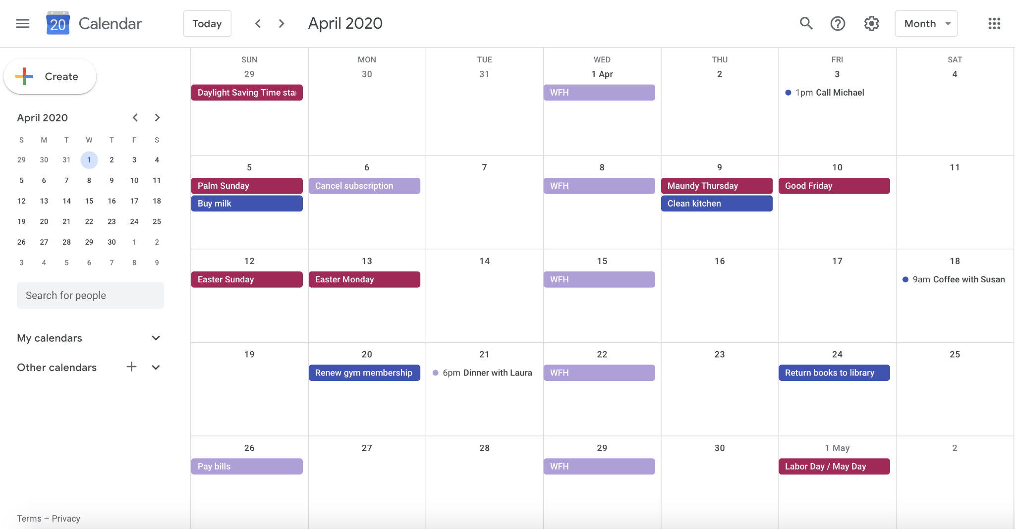
This setup presents some challenges:
- Delays in syncing
- Limited task arrangement options
- No direct way to check off tasks from the Google Calendar interface
- Look overwhelming, especially if you use different calendars for different purposes.
TickTick
TickTick, in contrast, offers an intuitive and dedicated calendar module within the app, eliminating the need for external integrations.
When you make changes in the TickTick calendar, they are instantly updated across your task lists without any delays.
The calendar provides three view modes: day, week, and month, along with color-code tasks and events based on tags, priorities, or lists.
This provides a visual cue for better organization.
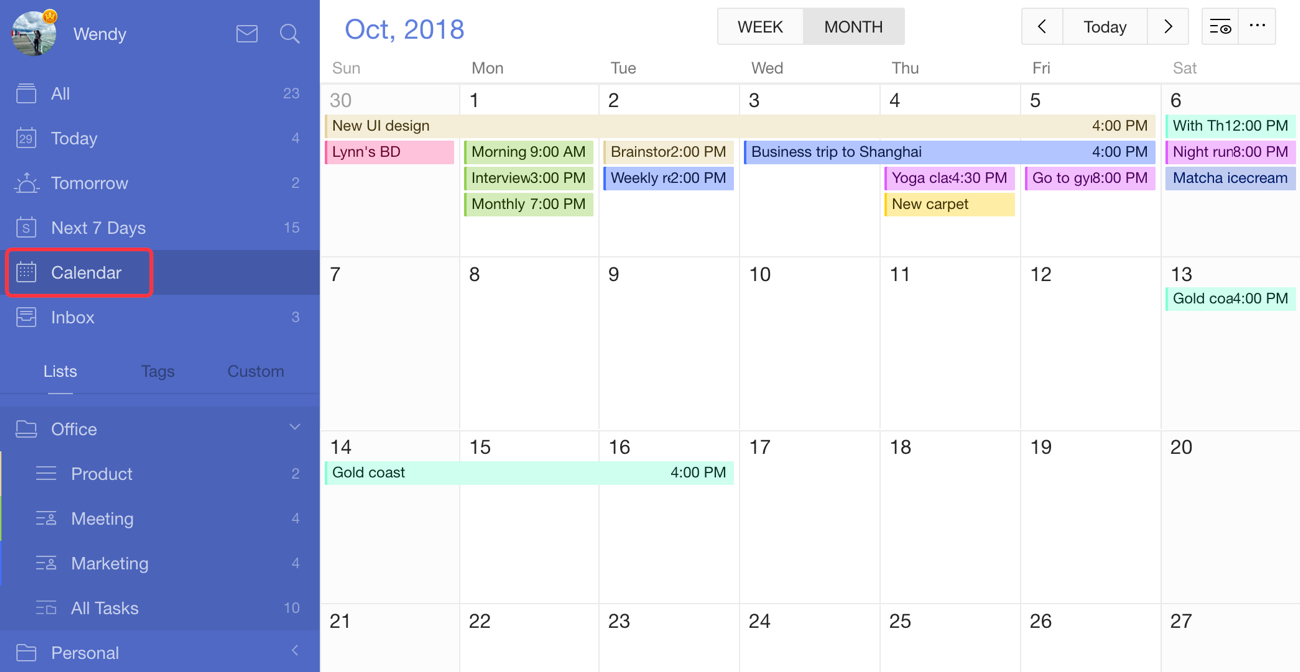
In conclusion, TickTick’s built-in calendar view provides a seamless and efficient experience while Todoist’s reliance on Google Calendar integration introduces potential syncing delays and complexities.
F. Productivity management features
When it comes to boosting productivity, Todoist and TickTick offer a range of additional features with their own unique approaches.
1. TickTick
Habits feature
TickTick’s “Habit” section is a fantastic tool for building positive routines.
With just a few clicks (or taps), you can add habits, set their frequency, and even choose a cool icon to represent them.
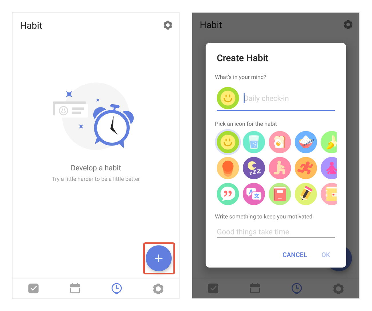
Checking off your habits is just the beginning.
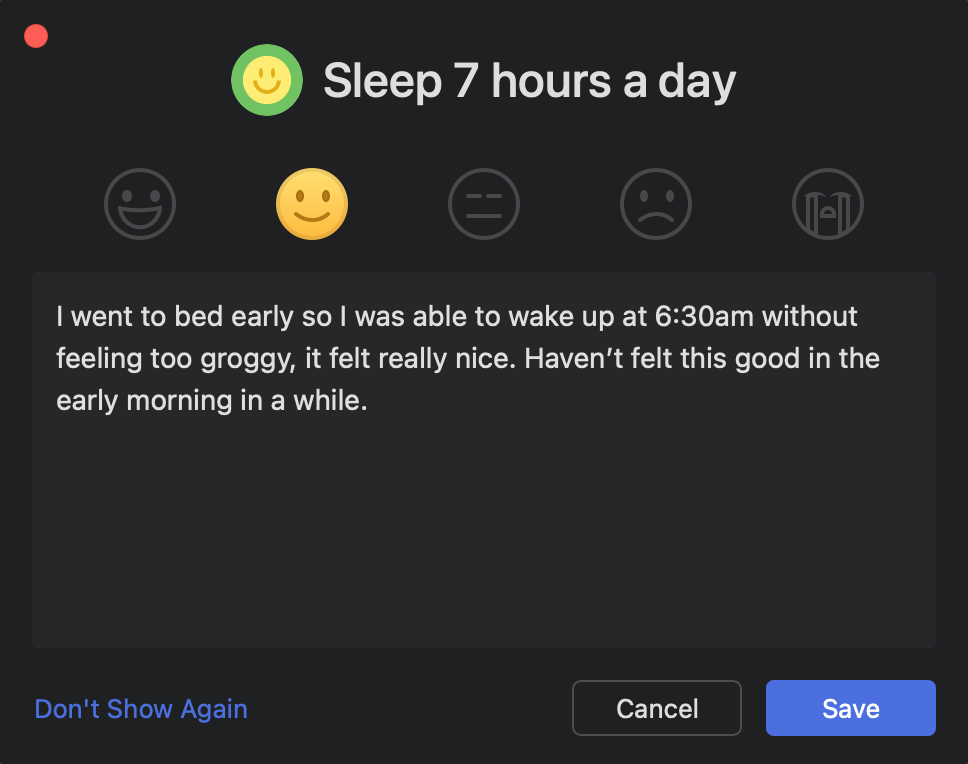
TickTick takes it a step further by providing a habit log feature, which prompts you to log your state of mind and any extra thoughts you may have, almost like journaling.
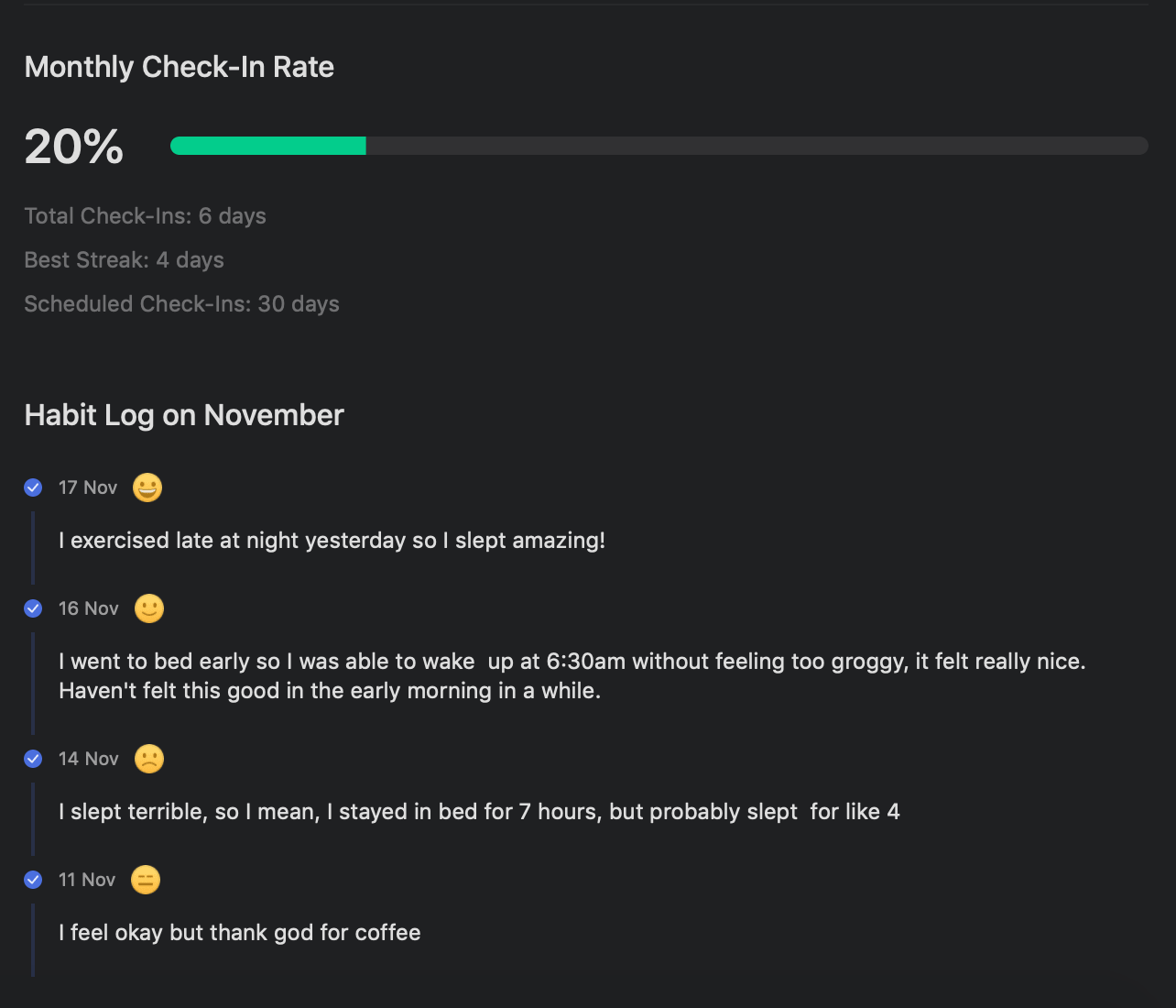
The Habit Stats feature keeps track of your habit stats, including check-in rates, streaks, and more.
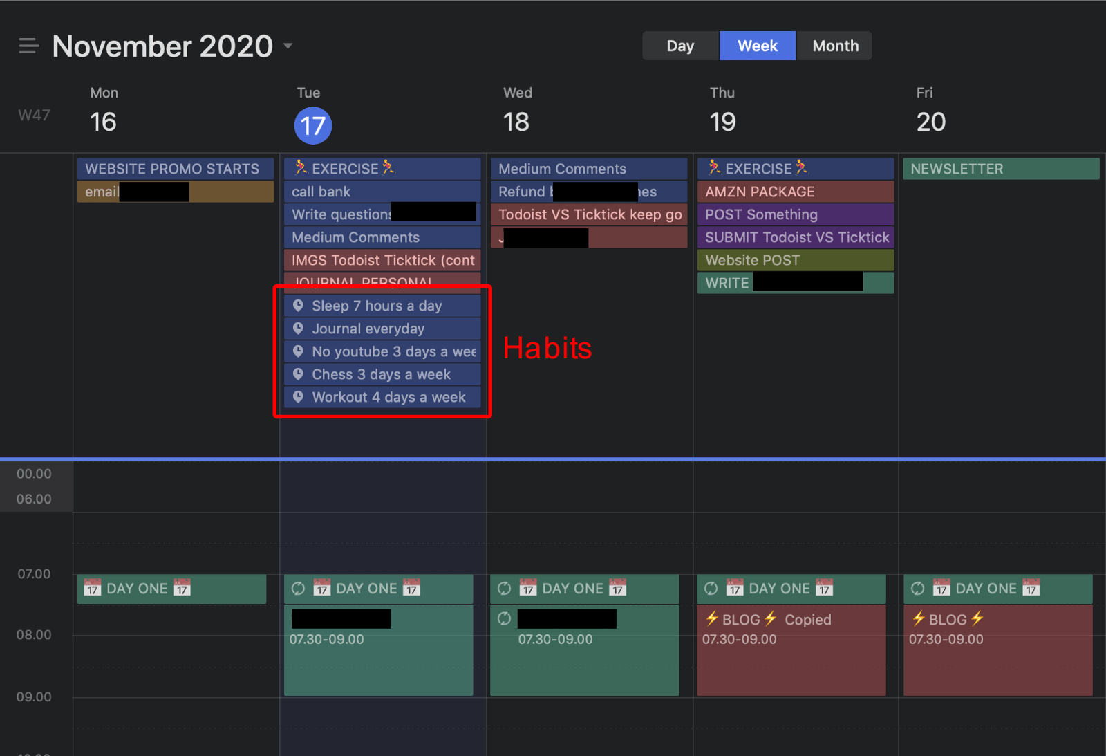
You can even display your habits on the calendar view and check them off right there. It’s a powerful feature for creating and maintaining healthy habits.
Pomodoro Timers
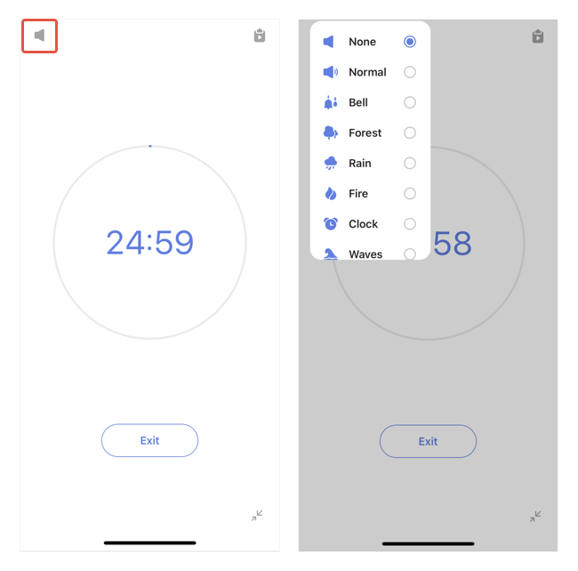
TickTick’s Pomodoro Timer is a game-changer for staying focused and productive.
It follows the famous productivity technique of working for 25 minutes and taking a 5-minute break. After every fourth “Pomo,” you’re rewarded with a longer, 15-minute break.
This systematic approach keeps you energized and motivated throughout the day.
2. Todoist
While Todoist has no dedicated habit section like TickTick, you can create a Goal-tracker project or use the pre-made goal-tracker template to track your habits effectively.
By pinning this project to Favorites, you can easily access it whenever you need to stay on top of your habits.
So, “What are Favorites?” – you might wonder.
“Favorites”
The “Favorites” section is on the left sidebar.
But during first log-ins, you might not see the section because it’s defaulted hidden until you mark a project, label, or filter as your favorites.
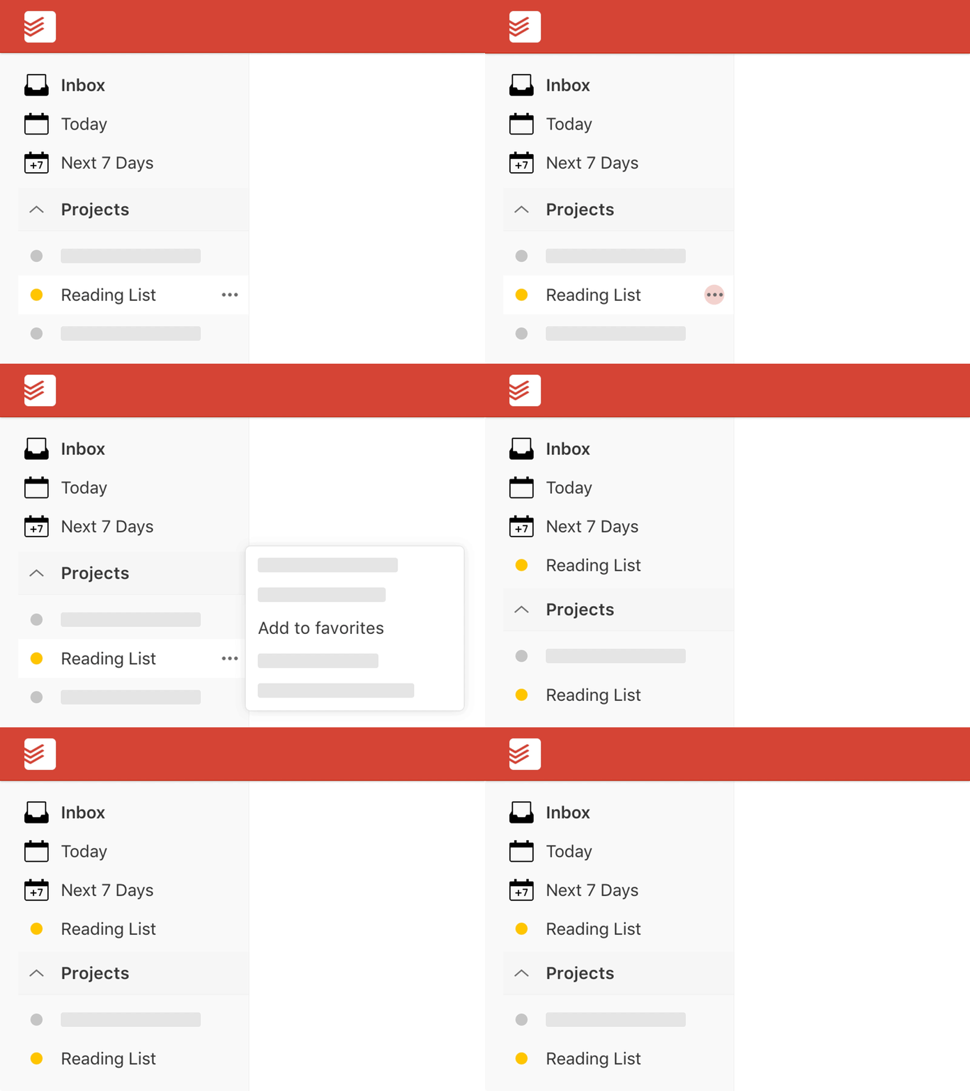
This is a handy feature because you can keep certain tasks, projects, or labels – that you frequently access – within reach.
Todoist Karma
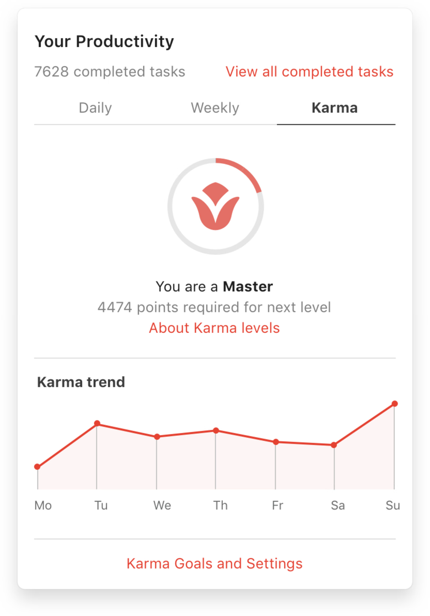
Todoist rewards your productivity efforts with Karma points.
When you complete tasks on time and maintain daily and weekly streaks, you earn points.
Utilizing advanced features like recurring due dates, labels, filters, and reminders will boost your Karma even further.
It’s a motivating system that incentivizes you to stay productive and achieve your goals.
Productivity View
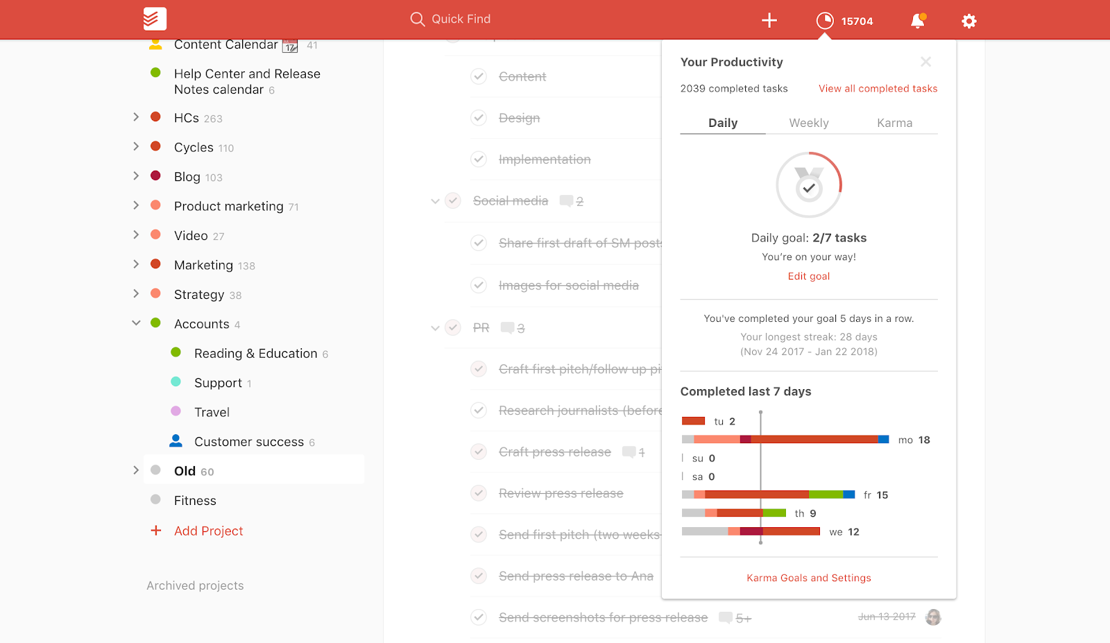
The Productivity view in Todoist provides valuable insights into your accomplishments.
You can track completed tasks on a daily and weekly basis, monitor your progress toward your goals, and gain visibility into your most active projects.
It’s a comprehensive snapshot of your productivity journey, easily accessible with just a click on your daily goal count.
III. TickTick vs Todoist: Pricing Plans & Subscription Options
A. TickTick
TickTick offers a free plan (although it comes with limited features) and a Premium plan for those looking to unlock the app’s full potential.
The Premium plan is available through monthly or yearly subscriptions.
Here are the details:
1. Free
TickTick offers many free features, such as filters and sorting, tags, multi-priority, repeating tasks, Pomo timers, sharing lists, etc.
Although it has limitations, it’s a great way to get started and explore TickTick’s capabilities.
2. Premium
As said, TickTick’s Premium version is available through two subscription options:
Monthly Plan: $2.99 per month.
Annual Plan: $27.99 per year, equivalent to just $2.4 per month.
The Premium plan is packed with more features to supercharge your productivity, including:
- Full calendar views, with start and end dates
- Custom filters
- Smart lists
- Activity log
- “Historical Statistics” feature
- Custom task manager reminders
- Premium white noises & themes
- Integration with various third-party apps and services
Moreover, you can share up to 299 task lists with others and create up to 999 tasks per list, enhancing collaboration capabilities.
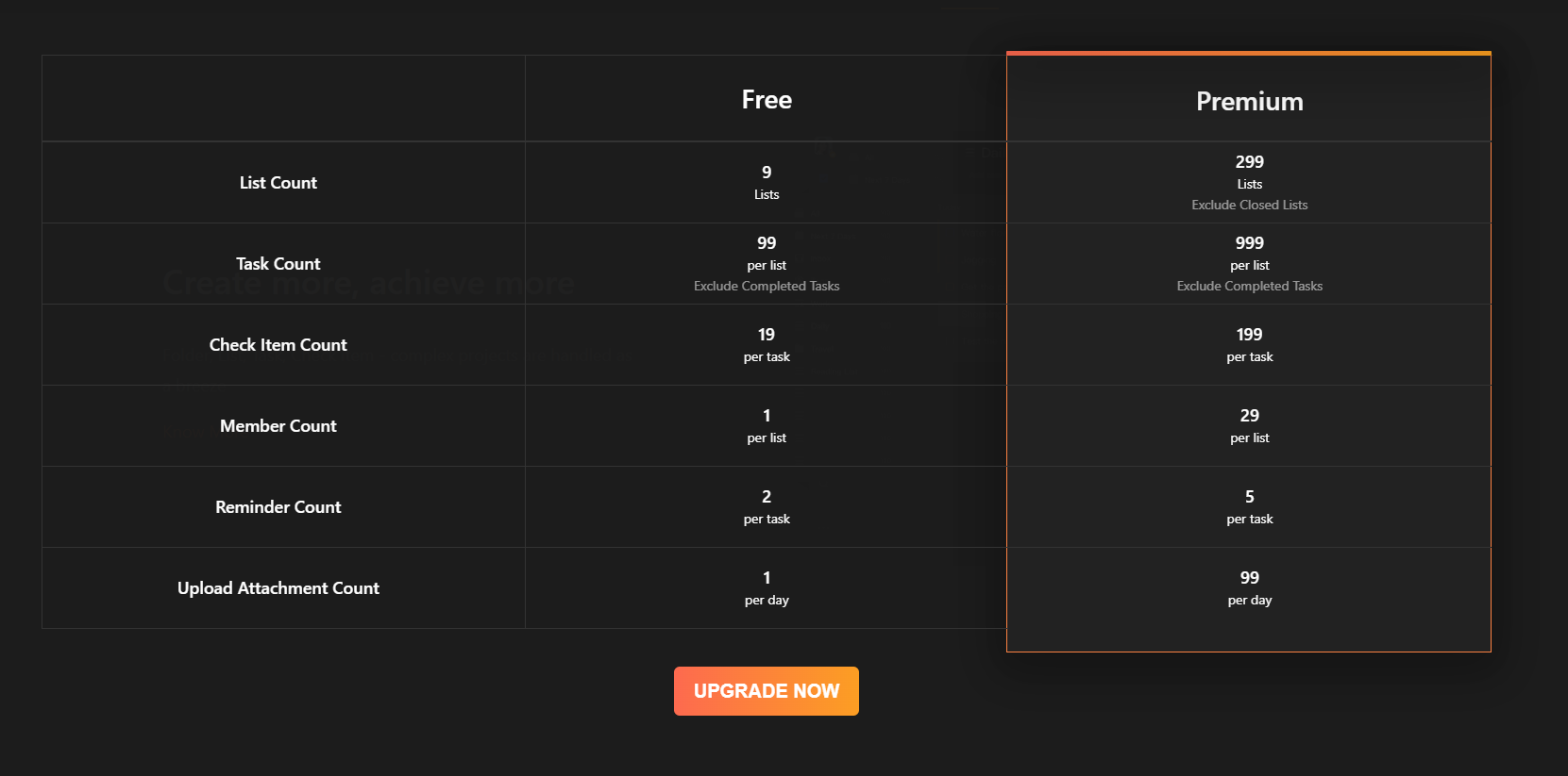
To sum up, TickTick’s free version is best for personal use. Those who need a simple and intuitive task management app to manage their personal errands like grocery lists.
To collaborate with others on projects, TickTick requires you to upgrade to the Premium account.
B. Todoist
Todoist offers more pricing tiers to cater to the diverse needs of many users.
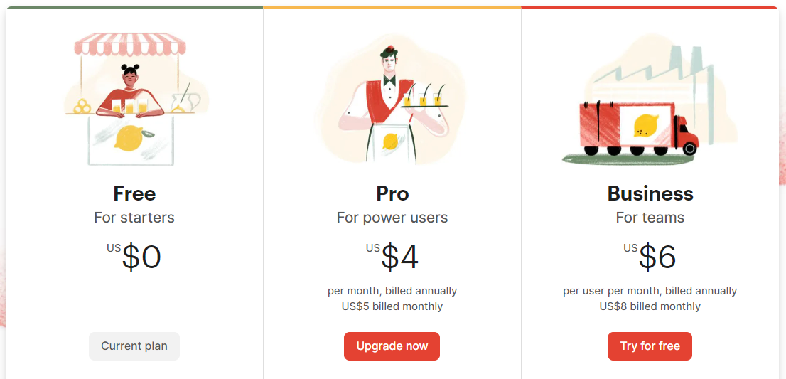
1. Free Version
Todoist provides a basic set of features for free, making it a great starting point for individuals who want to experience the app’s functionality.
2. Pro Version
Available through two subscription options:
Monthly Plan: $5 per month.
Annual Plan: $48.00 per year, equivalent to $4.00 per month.
Todoist’s Pro version offers a comprehensive suite of features, such as location-based reminders, shared team inbox, admin & member roles, etc.
Along with that, users can create up to 300 projects, collaborate with up to 25 people per specific project, and utilize up to 150 filter views per project, providing ample flexibility and customization.
3. Business Version
The Business’s pricing is as follows:
Monthly Plan: $8 per month.
Annual Plan: $72.00 per year, which amounts to $6.00 per month.
This version is tailored to the needs of larger teams and organizations, including all the Pro’s features plus 50 collaborators, 500 projects per collaborator, 300 tasks per project, and more.
IV. TickTick vs Todoist: Pros and Cons
1. TickTick’s pros and cons
Pros
- Advanced habit tracking – Easily create and track habits with customizable frequency and icons.
- Built-in Pomodoro timers – help manage time effectively and maintain a healthy work-life balance.
- Task location-based reminders – ensure that important tasks are prompted at the right time and place.
- Smart list creation – save you time and ensure that you always have the right tasks at your fingertips.
Cons
- No free collaboration features
- Not for teams that require extensive collaboration
- Easily cluttered if there are too many tasks
2. Todoist’s pros and cons
Pros
- Natural language processing input – help you quickly add tasks using simple language
- Free collaboration feature set – ideal for both teams on a tight budget
- “Favorites” feature – keep important tasks, projects, or labels within reach
- Productivity monitoring – easy to track your productivity and gain insights into your task completion and progress.
Cons
- No native calendar
- Unable to hide overdue tasks
V. Best alternative to TickTick and Todoist: Upbase
Now, if you’ve read through the TickTick vs. Todoist blog post and found that neither of these apps suits your needs, we’ve got an exciting recommendation for you: Upbase.

This app is a clever mix of a productivity app, a task management app, and a project management app – all in one place. Why is Upbase better than TickTick and Todoist? Let’s dive into its impressive features:
1. Intuitive Interface Design
Just like TickTick and Todoist, Upbase boasts a simplistic and user-friendly UI. This makes it easy to navigate and seamlessly manage your tasks and projects.
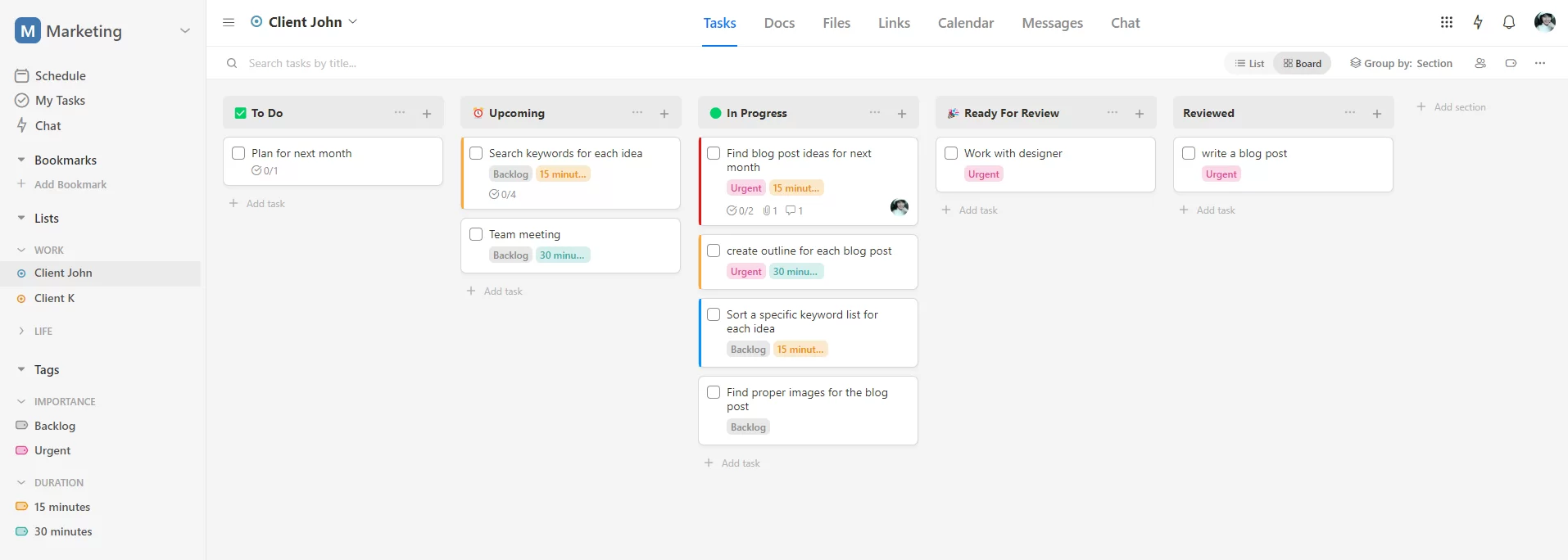
2. Comprehensive Productivity Management Feature Set
Upbase offers a wide range of features to boost your productivity.
You’ll have access to Pomo timers with customizable durations.

You can also add ambient sound to enhance your focus.

The app also provides:
- A private tool for journaling, named “Daily Notes
- A notepad for quick notes
- Features like time blocks and time boxing.

Annotation: Upbase’s notepad with slash commands.

Annotation: Upbase’s daily notes with slash commands & a customizable template.
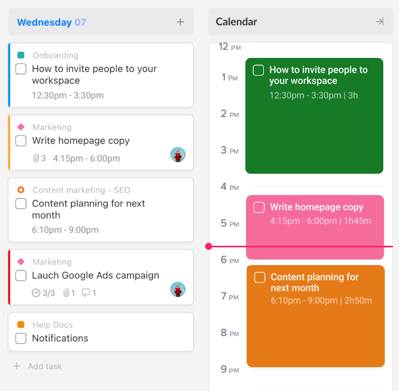
Annotation: Upbase’s time blocks.
3. Bookmark for Quick Access
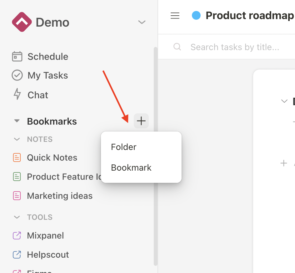
Similar to Todoist’s Favorites, Upbase introduces Bookmark – a feature that allows you to easily save important links for quick access.
Say goodbye to endless searching.👋
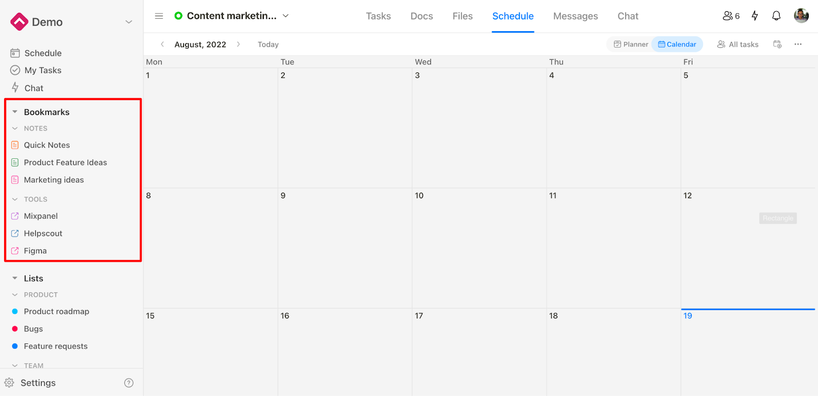
The cherry on top is you can organize your bookmarks into folders.
4. Deeper Hierarchical Structure
Upbase provides a deeper hierarchical structure compared to TickTick and Todoist.
Workspaces – Folders – Project Lists – Sections – Tasks – Subtasks
This allows you to manage tasks and projects of different scopes without cluttering the user interface.
There’s more!
Each project list in Upbase has seven defaulted modules:

- Tasks – for task management.
- Docs – for storing, organizing, and collaborating on native documents or embedded Google Docs.
- Files – for storing, organizing, and collaborating on files uploaded from your desktop computers or on embedded Google Drive folders.
- Links – for storing and sharing important links related to your projects.
- Calendar – for visualizing all the project tasks in multiple calendar views.
- Messages – for sending messages to your project team without leaving the app.
- Chat – for chatting with project teams, groups, or a team member in real-time.
But you can customize to show/hide any module to suit your project’s needs.

5. Full-Function Calendar
While TickTick requires a premium plan for full calendar functionality, Upbase offers it for free.
Not only that, but Upbase takes calendaring to the next level.
You’ll have access to both a private calendar for personal use and a shareable calendar for team collaboration.
Each calendar offers multiple view options.
The shareable calendar, which is available in each project, offers three views: Weekly Planner, Weekly Calendar, and Monthly Calendar.
The private calendar offers all those views, plus a Daily Calendar alongside a Daily planner.

6. Comprehensive collaboration capability
Upbase excels in team collaboration with features that go beyond TickTick and Todoist.
You can easily invite others into your workspaces or projects, tag team members, leave comments on tasks, and upload files.
Furthermore, you can chat, send messages, as well as share links, files, and documents with them.
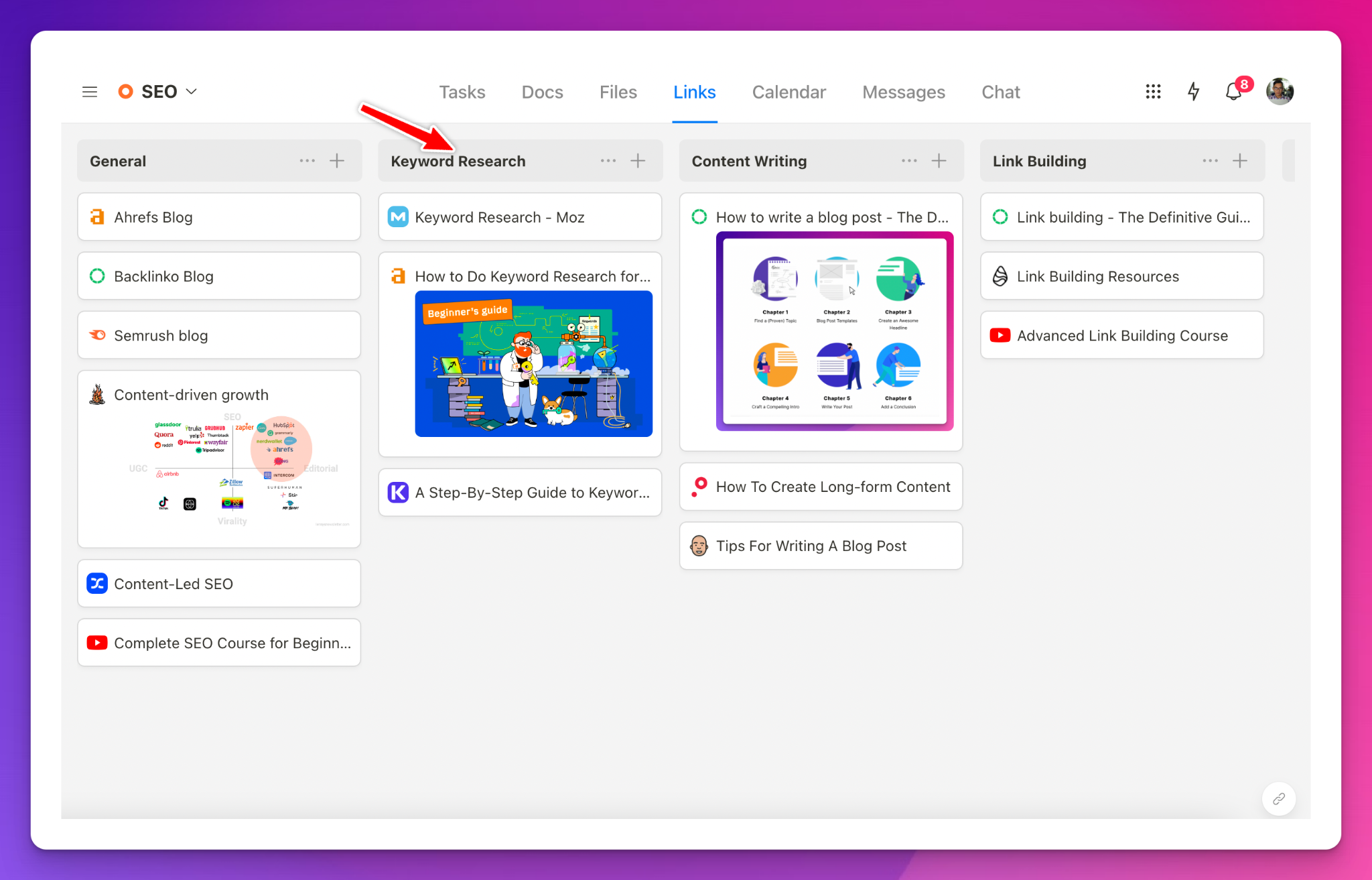
Annotation: Upbase offers a dedicated place for sharing project-related links.
7. Task tags and filtering system
Need to categorize tasks? Upbase offers robust tagging and filtering capabilities.
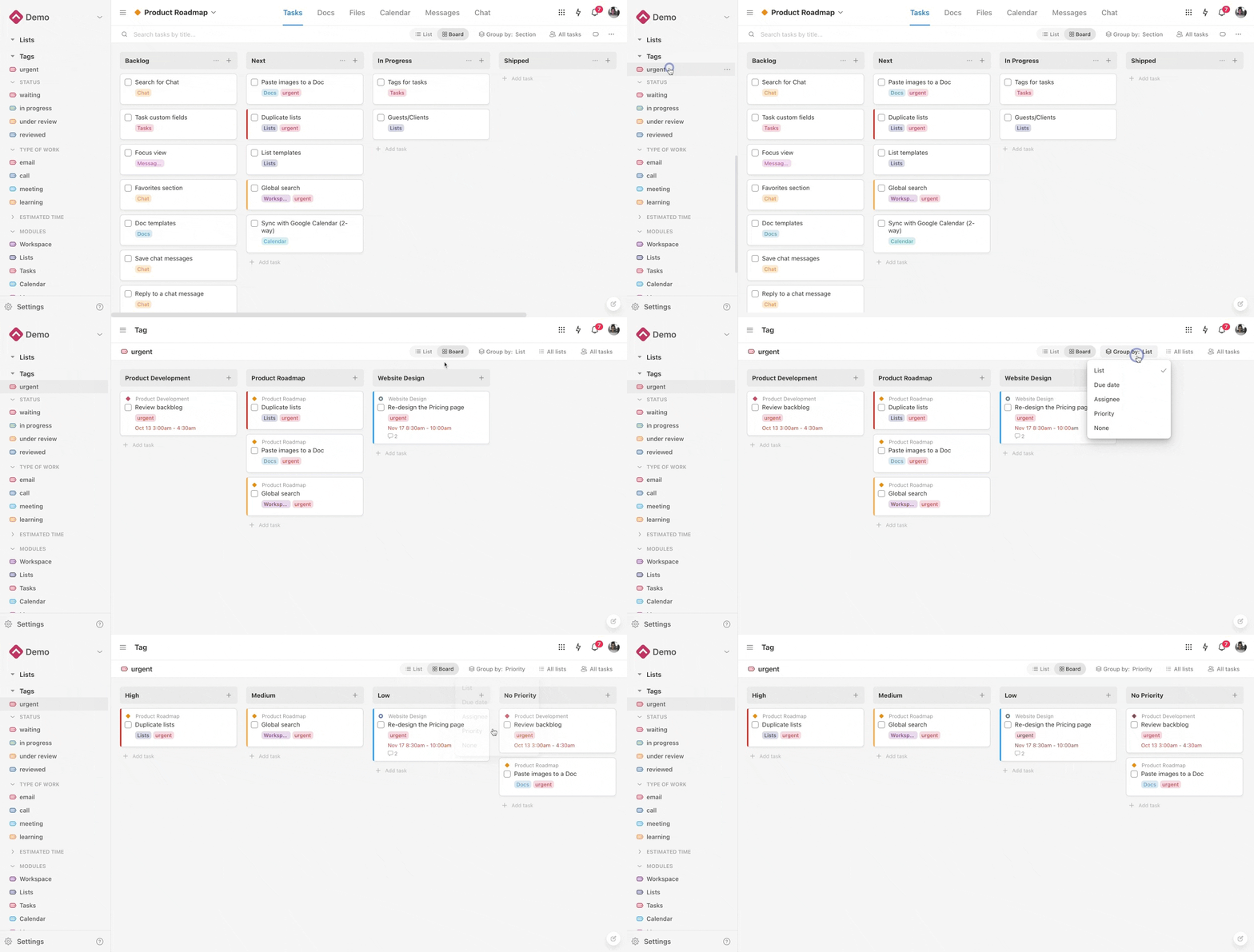
Unlike TickTick or Todoist, Upbase allows you to filter tasks using multiple tags.
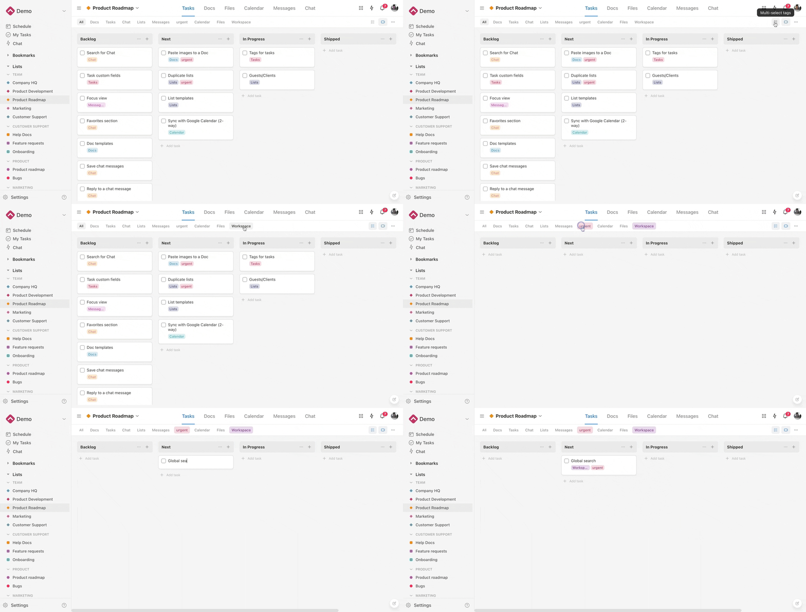
And filter tasks by tags in a workspace.
In a nutshell, Upbase helps you achieve work-life balance, maximize productivity, and easily track your goals, tasks, and habits.
Besides, it focuses on seamless team collaboration. Whether you’re an individual or part of a small team, Upbase is the ideal app to streamline your workflow and enhance productivity.
The cherry on top: Upbase offers a generous free plan with unlimited members, tasks, and storage.
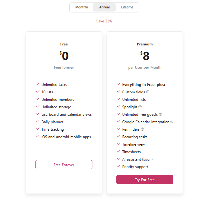
Give Upbase a try and experience a new level of productivity and collaboration. It’s time to take control of your tasks and projects with an app that truly understands your needs.
