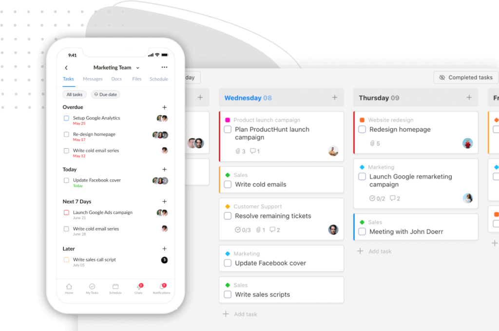
Unlike other task managers, Sunsama and Motion offer NO free version.
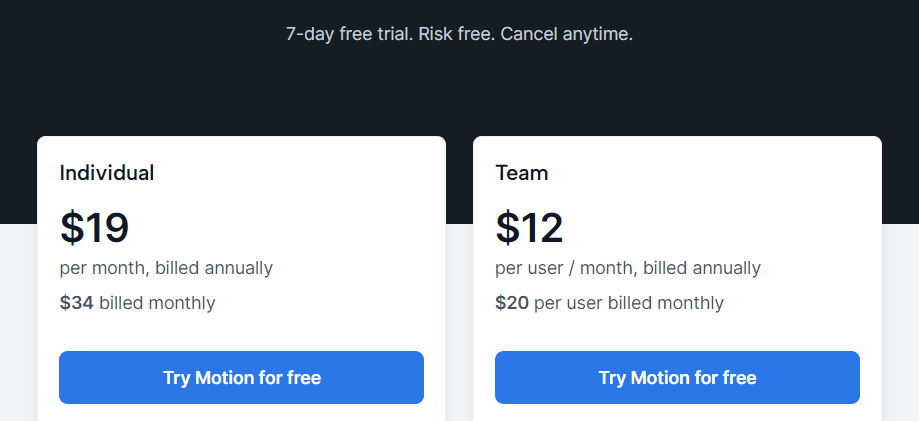
With Sunsama, you get a two-week free trial to decide if it’s worth the $16-$20 subscription fee each month.

Motion is no better.
Its trial period is only ONE week, and its subscriptions start at $19/user/month (for individuals) or $12/user/month (for teams).
But are these productivity tools worth the price?
Which packs more value for your bucks?
On top of that, which is the best fit for your workflow?
In this ultimate showdown of Sunsama vs. Motion, we’ll dive deep into their important features, functionalities, subscription offerings, and weigh the pros and cons of each app.
By the end of this article, you’ll have a clear understanding of which tool suits your workflow and delivers the most bang for your buck.
Ready? Let’s get started!
Sunsama vs Motion: An In-Depth Comparison
I. User Interface Design & Ease of Use
I felt surprised during the first log-in to both Motion and Sunsama.
They look up to 70% similar.
From the clear typography to the intuitive layouts and minimalist interface designs.
Even the way they use color codes to prioritize tasks and projects is the same, making it easy to stay organized.
Still, there are some minor differences between the two apps.
1. UI design style
Sunsama’s interface boasts a clean and organized aesthetic, with a white background and muted color palette.
On the other hand, Motion exudes a sleek vibe, featuring bold typography and more vibrant colors.
2. Layout
The layout of Sunsama is divided into three sections:
- Left menu – includes mini-sized calendars, team members, and channels.
- Center panel – shows scheduled tasks and calendars.
- Slideable right menu – shows goals, integrations, search tool, and unscheduled tasks.
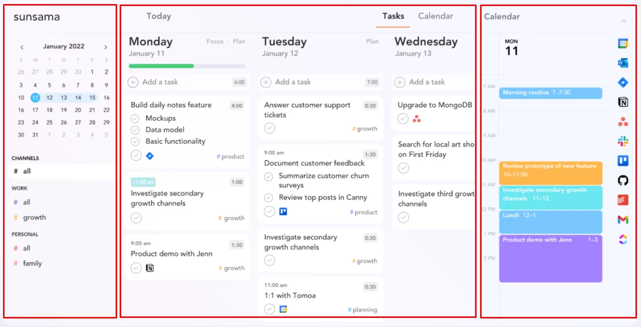
It’s a breeze to create tasks in Sunsama—simply hit the “+” button at the top of the desired date, type in the text box, and press “Enter”.
Motion’s dashboard-like layout offers a centralized hub for projects and tasks.
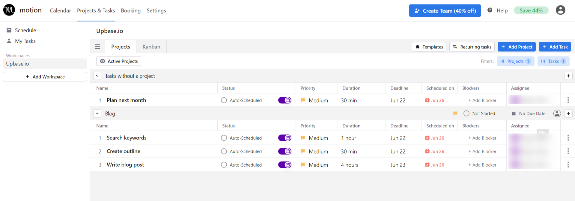
With modules like Calendar, Projects & Tasks, and Scheduler, Motion offers a holistic platform for managing tasks and projects, and collaborating with teams.
My thought
Compared side-by-side, it’s easy to notice that Motion has greater complexity than its competitor.
Motion takes a comprehensive approach to project management and team collaboration, while Sunsama is designed with a minimalistic approach, focusing on personal productivity.
So, although both apps share a commitment to visual appeal, Sunsama’s minimalist UI design offers a simpler and more streamlined experience.
On the other hand, Motion’s feature-rich user interface may require a bit more time to learn, making it a better fit for those seeking advanced project management capabilities.
II. Hierarchical Structure
In comparison, Sunsama’s structure is much simpler than Motion’s.
The reason is:
Sunsama is designed as a daily planner and task management app, while Motion caters to task scheduling, project management, and team collaboration.
Let’s take a closer look at how different their structures are.
Motion: Workspaces – Projects – Tasks – Subtasks
Sunsama: Tasks – Subtasks
III. In-Depth Feature Comparison
1. Task management
Sunsama and Motion are both good at task management.
They provide relatively comprehensive task details and share many similar features:
- Note, aka task descriptions
- Subtasks (with limited editing options)
- Start and due dates, due times
- Recurring tasks
- Comments & attachments
- Task activity logs

Annotation: Sunsama’s task detail pane.
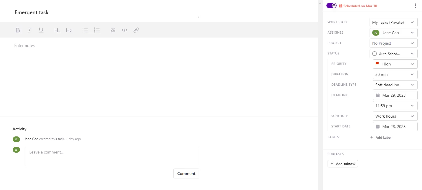
Annotation: Motion’s task detail pane.
However, it’s important to note that they aren’t completely identical; in fact, there are several significant differences between the two.
A. Type of tasks
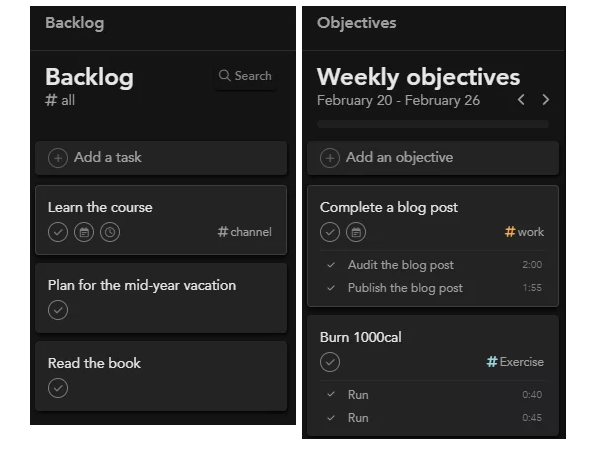
Sunsama classifies tasks into three types:
- Scheduled tasks
- Unscheduled tasks – which are stored in the “Backlog”.
- Objectives – which feel and look like tasks, but actually function as the goals or priorities for the week.
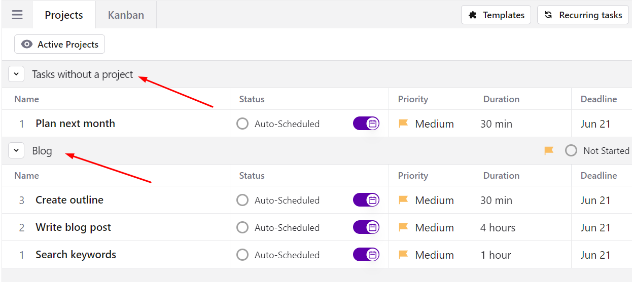
On the other hand, there are two types of tasks in Motion: tasks with or without projects.
B. Task categorization
Sunsama uses contexts and channels while Motion uses labels and statuses.
These features are created, edited, and customized in the app’s settings. In addition, they all are highly customizable.
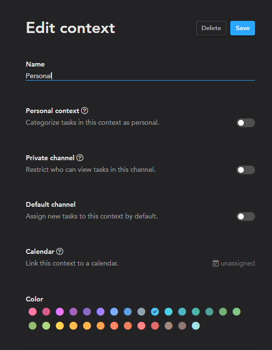
Sunsama’s contexts and channels
- Channels are designed to help you know where your time is spent.
- Contexts are for categorizing channels.
All the created contexts and channels are shown on the left menu in Sunsama.
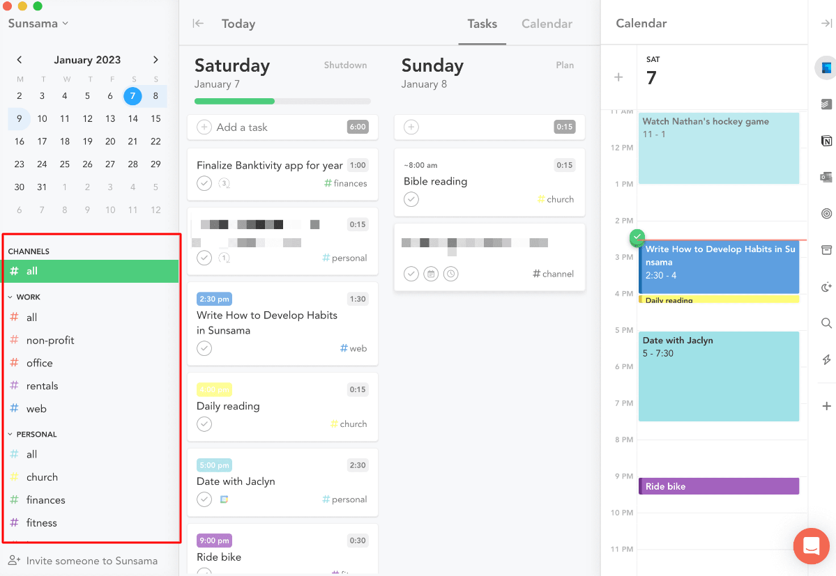
To filter tasks by a desired channel, click on that channel.
To filter all the tasks by a desired context and its nested channels, click on that context.
What’s great about Sunsama’s contexts and channels is their customizability.
Motion’s labels and statuses
Purpose: To categorize tasks and projects within a workspace.
But it’s worth noting that both are workspace-level features, i.e., you CAN’T create custom labels or statuses for projects.
Compared to Sunsama, there are some noticeable differences.
It’s more clicky to filter tasks by label/status in Motion
Motion has NO dedicated section for labels and status on the left menu.
To filter tasks by label or status, you need to:
- Navigate to the desired workspace.
- Click on the corresponding button on the top right headline.
- Select from the dropdown menu.
So, it takes at least three clicks to filter tasks by label/status in Motion, whereas, in Sunsama, you can do that with just a single click.
Motion’s labels and statuses are not as customizable as Sunsama
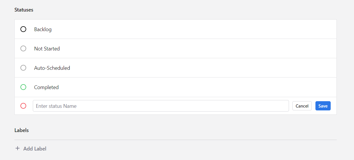
Motion has four statuses by default for all workspaces: Backlog, Not Started, Auto-Scheduled, and Completed.
The thing is, you CAN’T edit or delete them.
You can only add new ones. And here’s the second nuisance: you can’t customize the color or privacy of the status, but just the name.
Besides, you can’t filter tasks by labels in “My Tasks”.
3. Calendar
In Sunsama and Motion, the calendar is separate from other tools.
And both apps require connections with your Outlook or Google Calendar to enable the time-boxing feature.
Now, let’s compare them side-by-side.
A. Intuitiveness
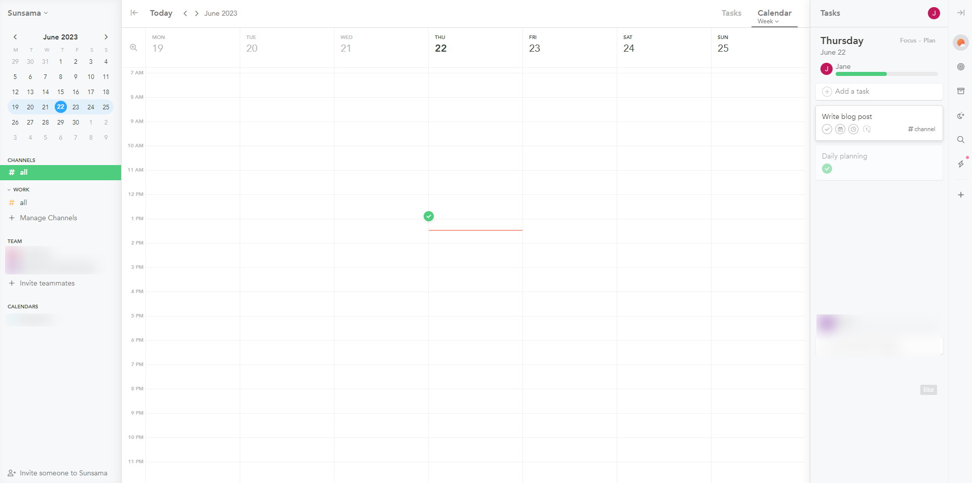
Here is Sunsama’s calendar layout.
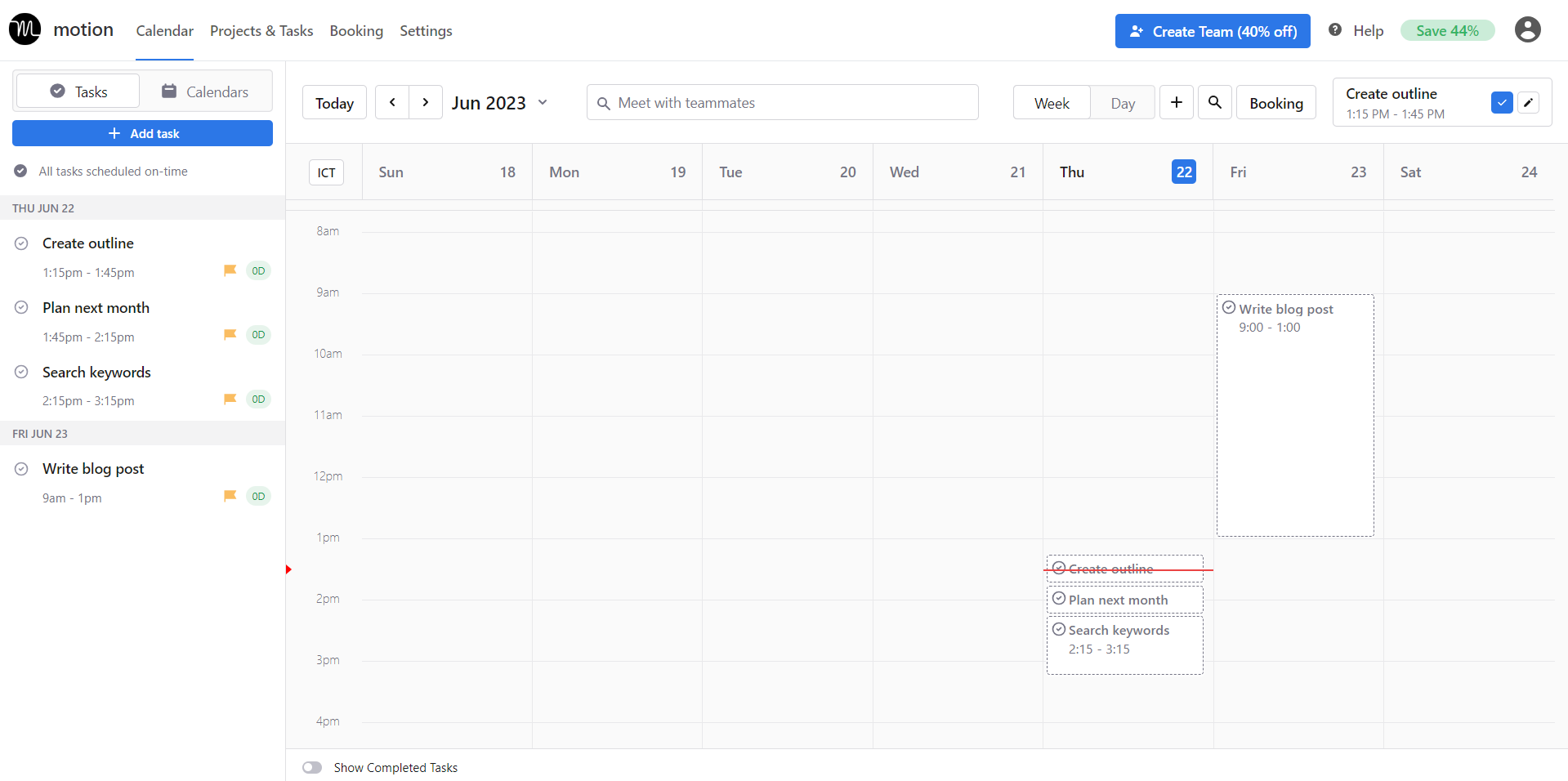
And here is Motion’s:
I personally like the layout of Sunsama because everything is logically organized, neat, and intuitive. The main panel is larger than the side menus, which keeps me focused on my schedule.
Motion’s calendar is a bit overwhelming to me.
Although its layout is simpler than Sunsama’s, big buttons and the too-wide left menu distract me. But I appreciate the visual “Show Complete Tasks” switch at the bottom, which makes it easy to see my completed work.
B. Timeframe options
Sunsama is the clear winner in this aspect.
The app offers five timeframe options: One Day, Three Days, Weekdays, Week, and Month.
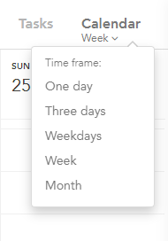
While daily, weekly, and monthly options are easily seen in most calendar tools, Sunsama’s “Three Days” is so unique. It shows your scheduled tasks yesterday, today, and tomorrow by default, but you can customize this view to your personal preference.
Motion’s calendar, on the other hand, has two timeframe options: Week and Day.

C. Function
This is where the real difference appears.
Motion uses artificial intelligence (AI) for auto-scheduling tasks – making it a smart calendar app, while Sunsama doesn’t.
Motion
To kick start Motion’s auto-scheduling function, you need to switch on this button.

Then, you’ll be asked to fill in the task duration, due date, and due time. These are musts! But if you want to help increase the accuracy of Motion’s AI algorithm, fill in other details such as start date, deadline types, label, etc.
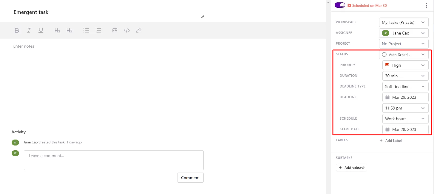
A plus is that Motion’s AI can learn from your input and automatically populate relevant details for subsequent tasks.
Once new tasks are already created, Motion will automatically prioritize and schedule that task on the calendar based on these attributes.
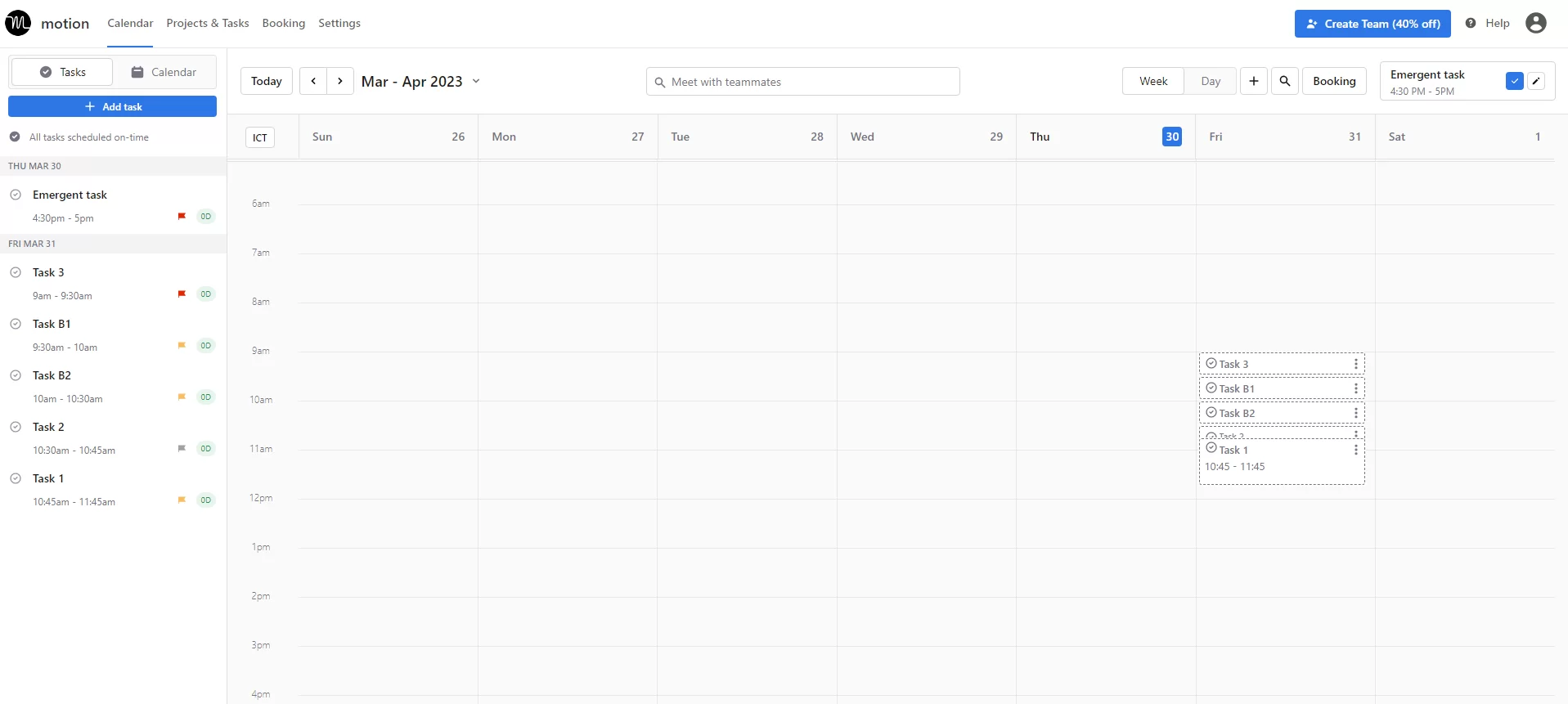
Sunsama
In Sunsama, everything still needs to be done manually.
Those task lists you create in the Tasks tab aren’t auto-scheduled on the calendar. So next, you have to:
- Navigate to the Calendar tab.
- Click the Today’s Tasks button on the (slideable) right menu.
- Drag tasks into the calendar interface.
Alternatively, you can add tasks and schedule them directly in the Calendar tab.
However, neither way is efficient.
The fact that you CAN’T directly add the start and due time in a task detail pane makes task scheduling in Sunsama so clicky.
D. User experience
But at least Sunsama provides a smooth user experience, unlike Motion–which is plagued by lag.
It’s also buggy.
Is that acceptable? Especially considering that Motion comes with a cost of $19/user/month, offers only a 7-day free trial, and requires your credit card information to get started?
Also, take note that Motion’s unique selling point is its AI scheduling. But this function only works once you connect with an Outlook or Google Calendar.
4. Team collaboration
Both productivity apps provide a few features for team collaboration.
A. Sunsama
You can invite teammates to Sunsama via links or Google contacts (with an extra charge, of course).
Once your team calendars are added to the workspace, you can start adding tasks for a teammate.

Those tasks will then auto-appear on the teammate’s calendar.
You can also add task notes and deadlines, leave comments, and attach files if needed. To quickly track progress, look at the progress bar at the top of their checklist.
Note: Sunsama doesn’t have priority levels or support assigning tasks to a person.
B. Motion
With this productivity tool, you can invite your team to the workspace, then create and assign tasks to a teammate.
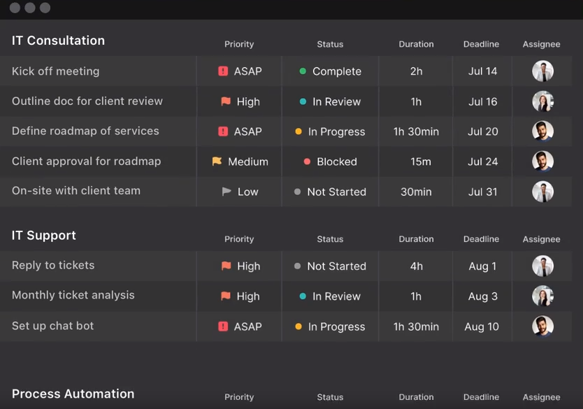
You can also add notes, priority levels, and deadline type, as well as leave comments and attach files within the task. This helps the teammate get a better understanding of their assigned task.
But there’s more, Motion provides:
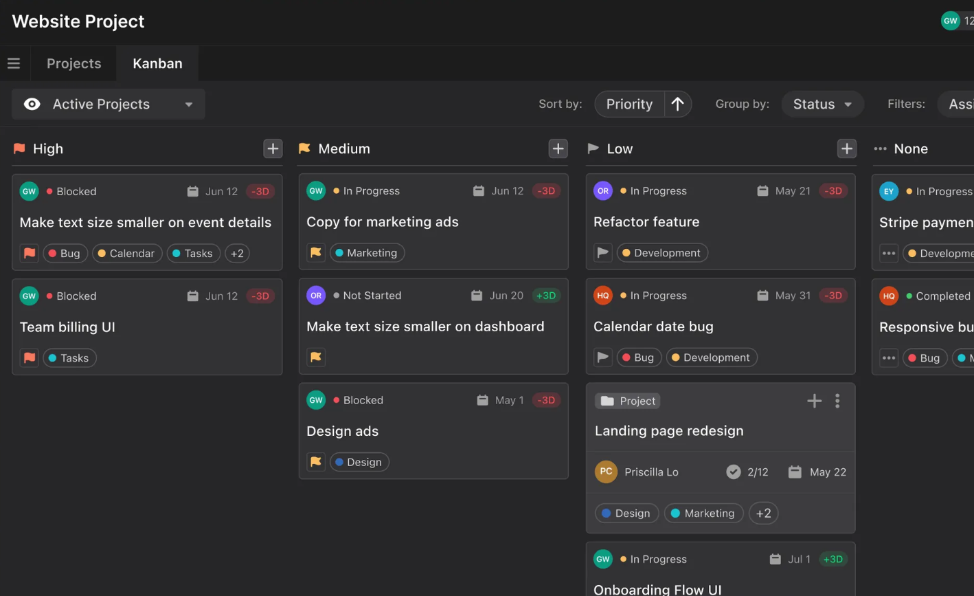
- A Kanban board view – designed with various filters for easy tracking and organizing tasks.
- A shareable calendar – where you’ll get an overview of each teammate’s schedule.
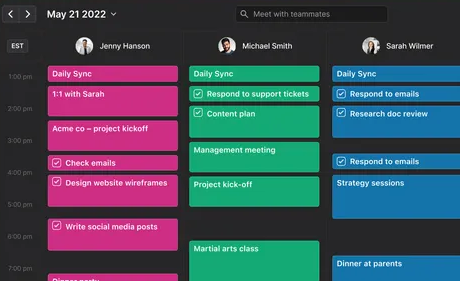
Theoretically, Motion AI could auto-schedule the day’s tasks for each member. But in fact, its laggy design ruins the experience.
5. Productivity features
A. Focus mode
Sunsama provides a Focus mode, which features a daily to-do list placed side-by-side on a daily calendar.
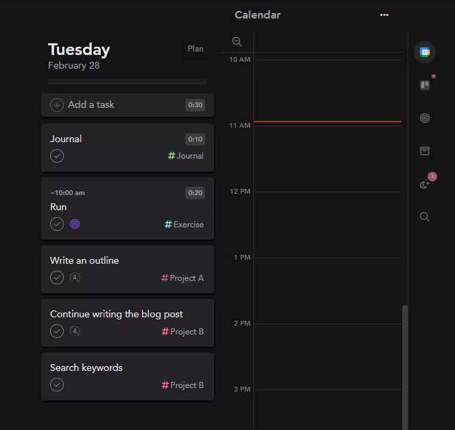
As its name implies, this mode is designed to enhance the user’s focus on the day’s work. To open it, hit this button.

Motion doesn’t have the Focus mode, but its Day view on the Calendar page functions the same.
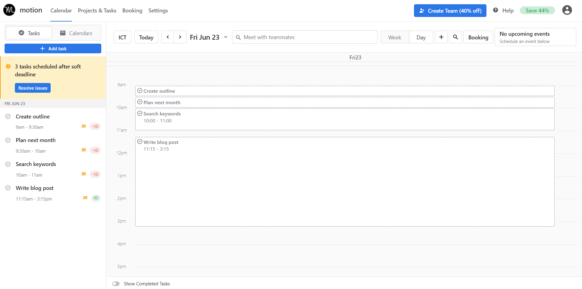
(Although it looks not as intuitive as Sunsama.)
Note: Sunsama’s Today view is only available on the current day, while Motion is more adjustable – you can select the day to open the Focus view.
B. Timeboxing
Both productivity apps have this feature, which helps you know what to do during your workday and for how long.
Motion even takes it to the next level by providing the option to split a too-long task into smaller chunks.
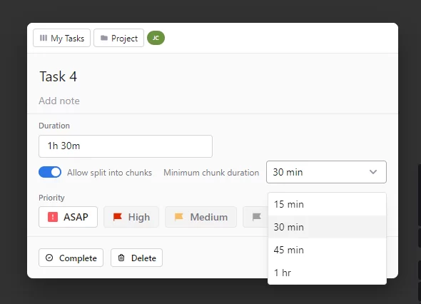
C. Time blocking
This feature is available on the Calendar page of both apps, as long as you connect with your Outlook or Google Calendar.
But as mentioned, Sunsama wins in this field because its calendar offers more timeframe options, plus its smoother UX.
D. Timers
Another similar feature that both apps share!
Whenever you’re ready, hover over the task you want to execute, and click the timer. This way, you can easily track the actual time spent on a task.
But it’s worth noting that Sunsama’s timers work a bit differently from Motion’s.
When you play the task timer in Sunsama, it counts up.
In Motion, it counts down.
6. Other unique features of each app
A. Sunsama
Here are other unique features of Sunsama:
- Keyboard shortcuts – to help manage tasks more quickly with fewer clicks.
- “Align with objective” – to align a certain task to one of your objectives.
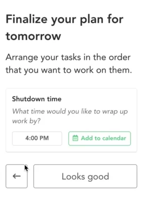
- “Daily Shutdown” – to maintain work-life balance and avoid burnout.
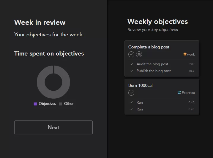
- Weekly reviews and analytics – that show where your time went in a week, visualize your weekly workload in charts, and reflect on your performance.
B. Motion
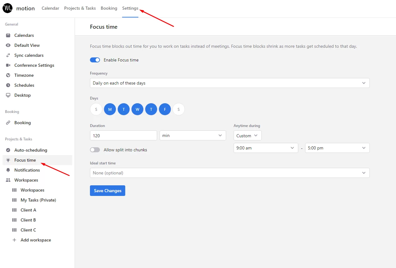
“Focus Time” mode – to separate work sessions from meetings, so you can control your time better.
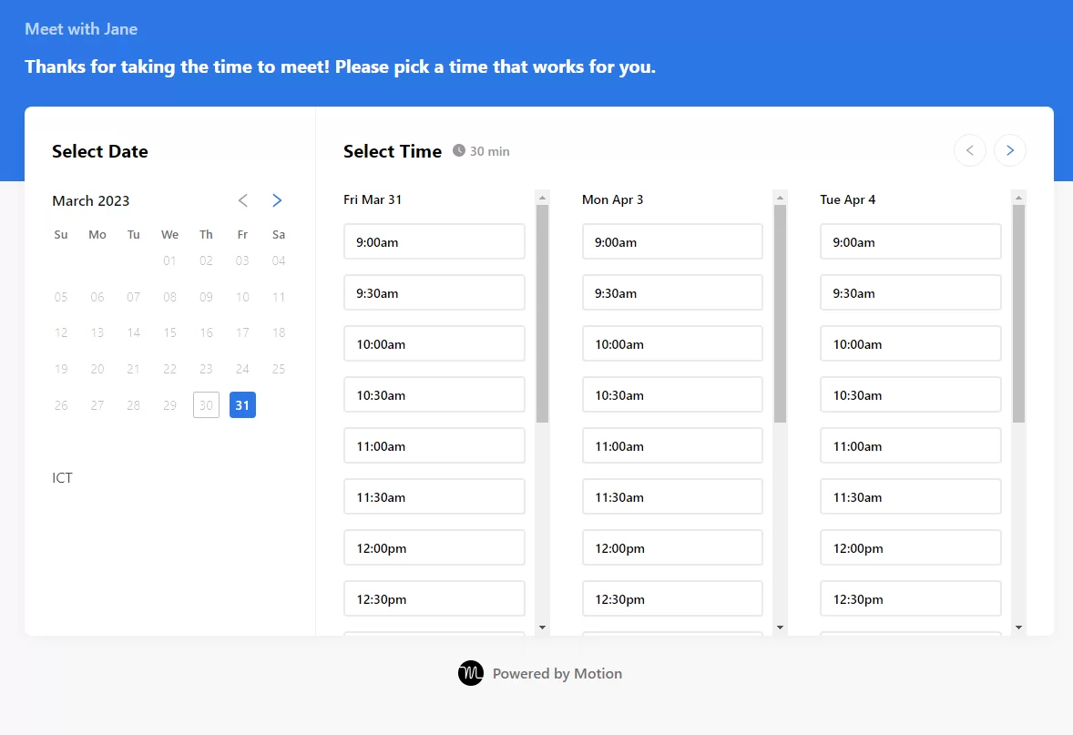
Meeting scheduler – a tool for saving time on scheduling meetings, and preventing problems like missed meetings or double bookings.
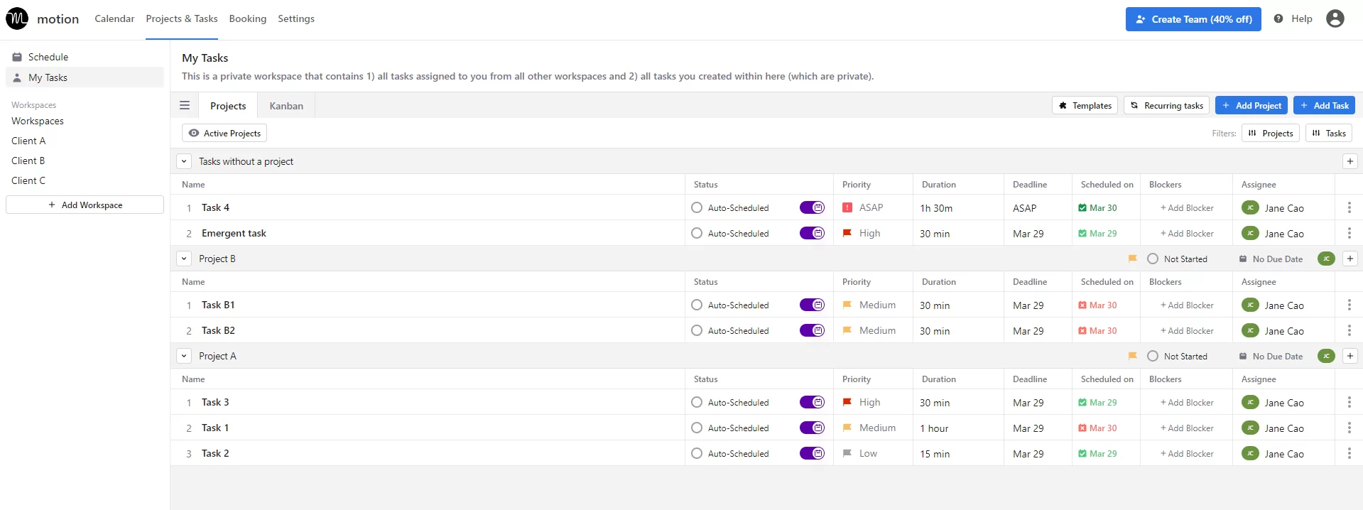
My Tasks page – a separate and private place in Motion that gives you an overview of tasks assigned to you from all workspaces and tasks you create.
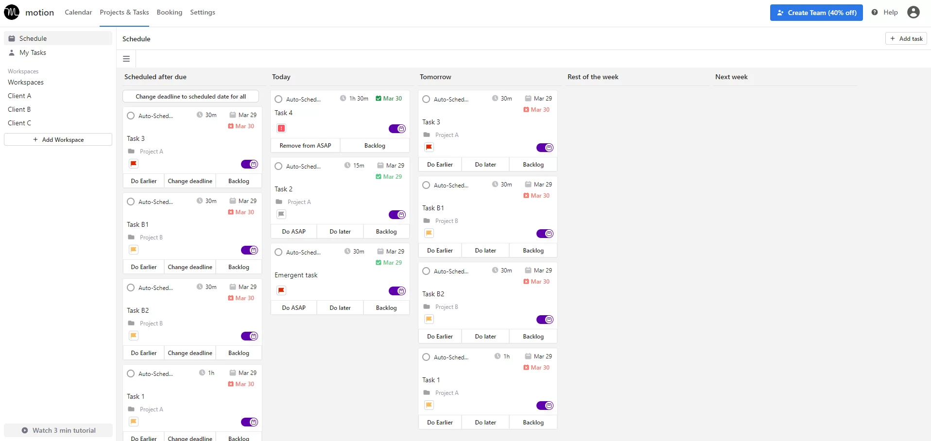
Schedule page – where you can get an overview of overdue work, today’s to-do list, and upcoming tasks.
V. Pros and Cons of Each App
1. Sunsama
Pros
- Low learning curve
- Smooth user experience
- Neat and user-friendly interface design
- Support tracking progress for the day and week
- Keep tasks from your existing tools in one page for better management
Cons
- No free version
- Too short free trial & high prices
- Not for project management
- Too basic collaboration features
- No built-in calendar tool
2. Motion
Pros
- Use AI to auto-schedule tasks
- Easy to track tasks and projects within a workspace
- Provide separate pages (“My Tasks” and “Schedule”) for better task management and scheduling
- Help teams collaborate more seamlessly on tasks and projects
- Efficient to book meetings
Cons
- Too laggy and faulty
- Overwhelming for beginners to learn
- No free version; expensive pricing; & too-short free trial
- Require your credit card information to get started
So, when it comes to Sunsama or Motion, here’s what the future holds for you:
Option 1: Spend one or two weeks experimenting with the app, only to discover that it doesn’t meet your preferences.
Or,
Option 2: Commit to a monthly expenditure of approximately $16-$34 if you opt to continue using it.
But really, do we need to pay that much?
What if I told you there’s an app that’s as multifunctional as Motion and Sunsama, but free to start – without requiring your credit card?
Plus, its price range is only half of the two other apps.
Doesn’t that sound like a better option? If so, let’s move on to the next part.
VI. Meet the Best Alternative to Sunsama and Motion: Upbase
Upbase is a powerful productivity tool built with all the features needed to serve as a great task manager, project manager, calendar, and planner.
As mentioned above, Upbase is as robust as Motion and Sunsama but costs only half the price. Look at this comparison table:
| Upbase | Sunsama | Motion | |
|---|---|---|---|
| Free plan | ☑️ | ❌ | ❌ |
| Paid versions
(per user/month) | $5-$9 | $16-$20 | $19-$34, for individuals
$12-$20, for teams |
| Project management | |||
| Folders | ☑️ | ❌ | ❌ |
| Project lists | ☑️ | ❌ | ☑️ |
| List and Board views | ☑️ | ❌ | ☑️ |
| Task management | |||
| Task creation sidepanel view | ☑️ | ❌ | ❌ |
| Task creation popup view | ☑️ | ☑️ | ☑️ |
| My Tasks page | ☑️ | ❌ | ☑️ |
| Priority feature | ☑️ | ❌ | ☑️ |
| -Notes
-Start and due dates -Start and due times -Subtasks | ☑️ | ☑️ | ☑️ |
| Task categorization | Tags | Contexts & Channels | Labels & Statuses |
| Collaboration | |||
| Real-time chat | ☑️ | ❌ | ❌ |
| Messages | ☑️ | ❌ | ❌ |
| Invite guests | ☑️ | ❌ | ❌ |
| Links | ☑️ | ❌ | ❌ |
| Watchers | ☑️ | ❌ | ❌ |
| Shareable calendars | ☑️ | ☑️ | ☑️ |
| Comments & Attachments | ☑️ | ☑️ | ☑️ |
| Assignee | Unlimited | ❌ | One |
| Calendars & Planners | |||
| Built-in calendars with time blocks | ☑️ | ❌ | ❌ |
| Daily and weekly calendar views | ☑️ | ☑️ | ☑️ |
| Monthly calendar view | ☑️ | ☑️ | ❌ |
| Daily and Weekly planner views | ☑️ | ☑️ | ☑️ |
| Weekday calendar view | ☑️ | ☑️ | ❌ |
| Show completed tasks | ☑️ | ❌ | ☑️ |
| Schedule page | ☑️ | ❌ | ☑️ |
| Auto-schedule | ❌ | ❌ | ☑️ |
| Meeting scheduler | ❌ | ❌ | ☑️ |
| Productivity management | |||
| Notepad | ☑️ | ❌ | ❌ |
| Daily Journal | ☑️ | ☑️ | ❌ |
| Private bookmarks | ☑️ | ❌ | ❌ |
| Time blocking | ☑️ | ☑️ | ☑️ |
| Timers | ☑️ | ☑️ | ☑️ |
| Keyboard shortcuts | ☑️ | ❌ | ☑️ |
| Dark & Light modes | ☑️ | ☑️ | ☑️ |
And don’t worry, Upbase is quick to learn.
Despite its comprehensive feature set, Upbase boasts a logical layout and user-friendly interface to never overwhelm new users.
Take some examples.
1. Daily & Weekly Planners
A. Daily Planner
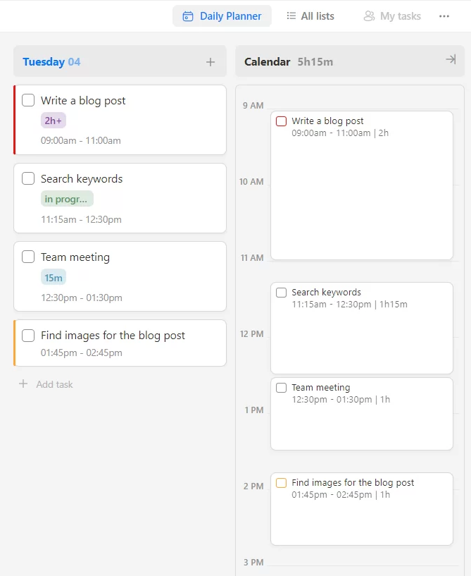
This view looks and functions like Sunsama’s Focus mode. It features:
- Daily planners
- Daily calendars with time block features
- Drag-and-drop interface
To show or hide completed tasks, just click the “…” button on the top right corner and toggle the switch.
But making Upbase’s Daily Planner truly stand out is this slideable panel.
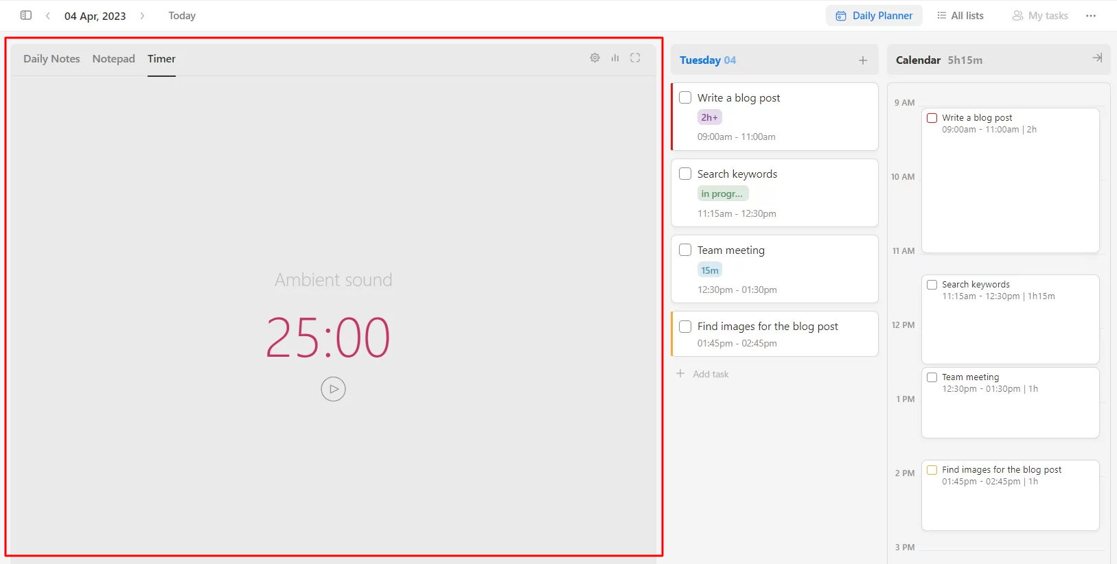
It includes three tabs:
- Pomodoro timers – to manage time spent on a task.
- Notepad – help you capture thoughts and take notes quickly, then go back to work.
- Daily Notes – serve as a daily journal tool where you can reflect on your day and feel calm.
All are designed with your productivity in mind.
The built-in Pomodoro timer comes with various ambient sounds to maximize your focus.
The two note tools feature slash commands so that you can type faster with fewer mouse clicks required.
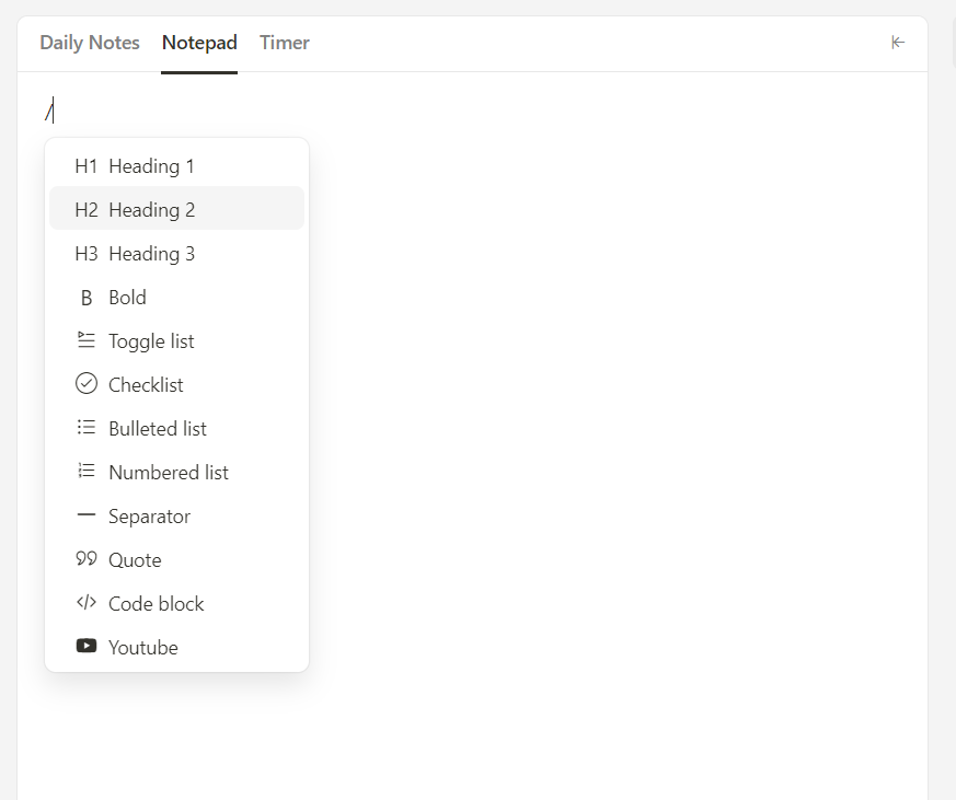
Moreover, the Daily Notes provides a fully customizable template and a separate space that shows you all the notes taken.
You can also view your completed tasks side by side with notes for more context.
B. Weekly Planner
This view resembles Sunsama’s Tasks tab, offering a similar experience.
When you add tasks to a specific day, their due dates are automatically set for that date. If you choose to drag and drop tasks to another day, their due dates will be adjusted accordingly.

You can also drag and drop unscheduled or overdue tasks into the planner for quick planning.
But there’s more!
Upbase provides two other views: Weekly Calendar and Monthly Calendar.
2. Task Manager
You can categorize tasks into project lists and customize the workflow the way you want.
The setup is quick and easy.
Upbase also provides various task details such as notes, priorities, start and due dates, start and due times, recurring tasks, etc.
Therein, Upbase subtasks have the same options as a parent task, except they don’t support creating nested subtasks.
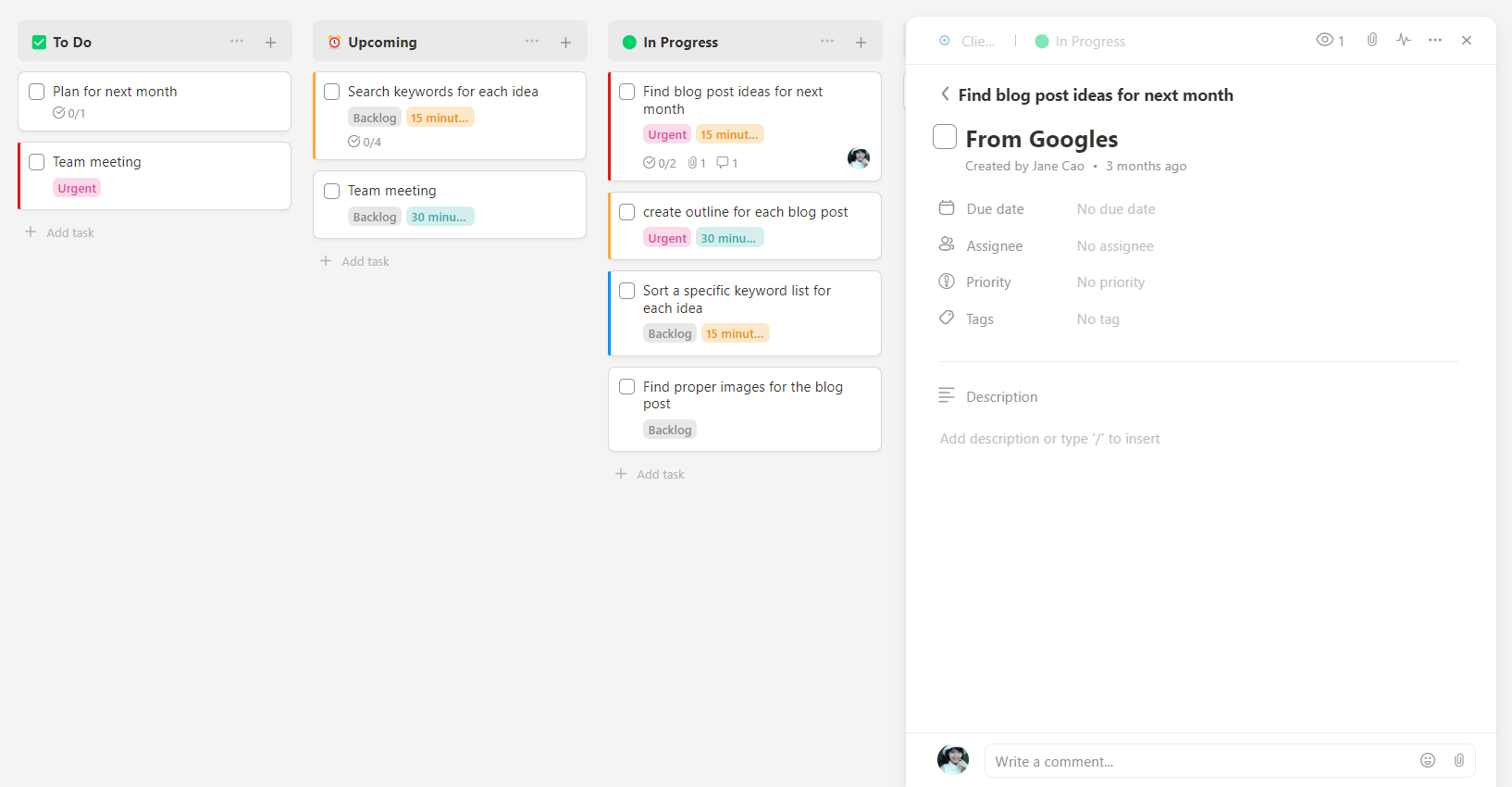
Motion and Sunsama, conversely, only provide basic subtasks.
Another feature making Upbase stand out is task tags with a robust filtering system.
You can filter tasks by a tag at both project and workspace levels–with a few simple clicks.
The app also allows you to select multiple tags to filter tasks within a project – something hardly found on other productivity tools.

3. Collaboration
As you might notice, “Tasks” is just one of the seven defaulted tools within each project list in Upbase.

All these tools are designed for team collaboration:
- Docs – to store, organize, and collaborate on native documents and embedded Google Docs.
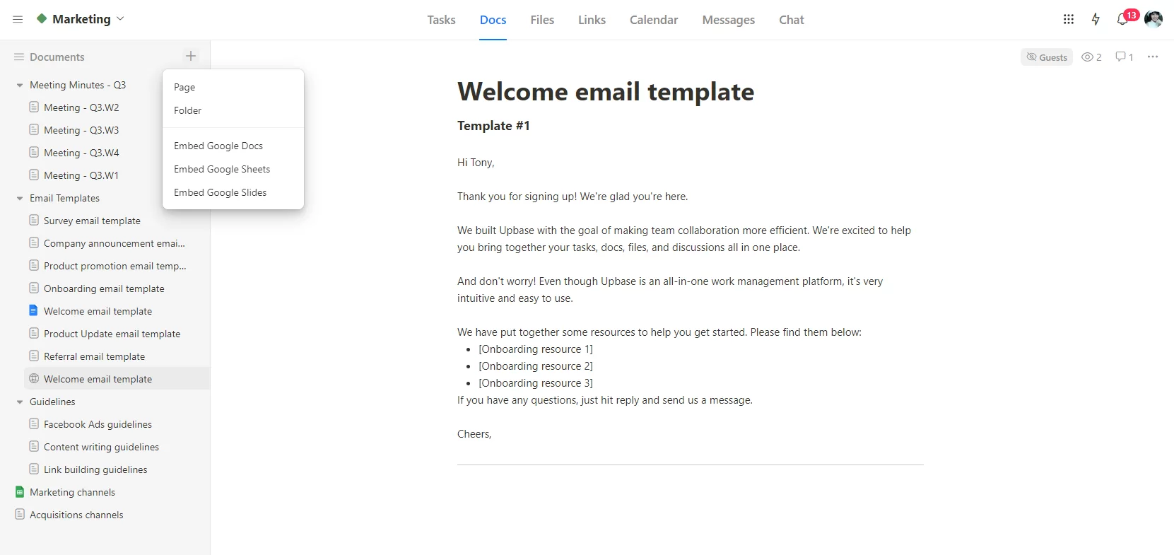
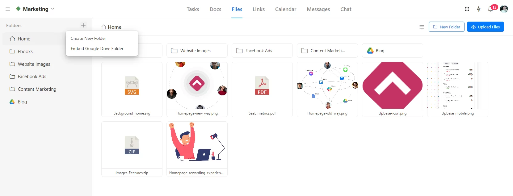
- Files – to store, organize, and collaborate on uploaded files and embedded Google Drive folders.
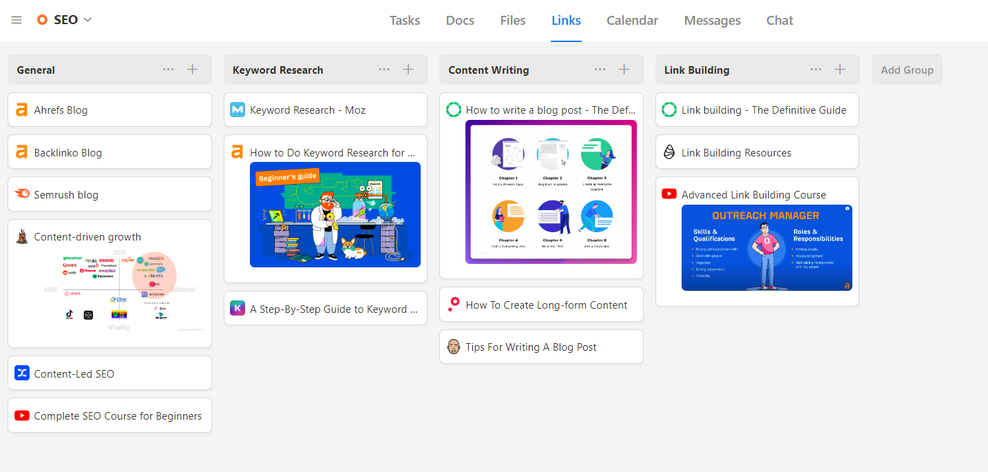
- Links – to store, organize, and collaborate on project-related links.
- Calendar – a shareable calendar for team members to collaborate on.
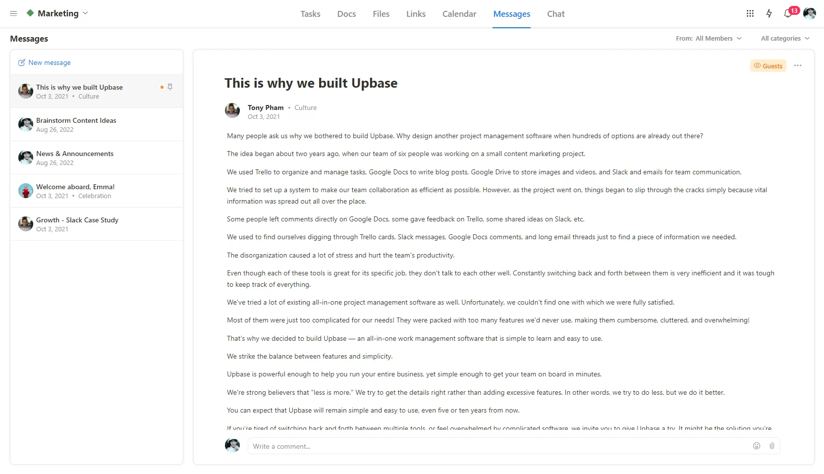
- Messages – to serve as a native email tool.
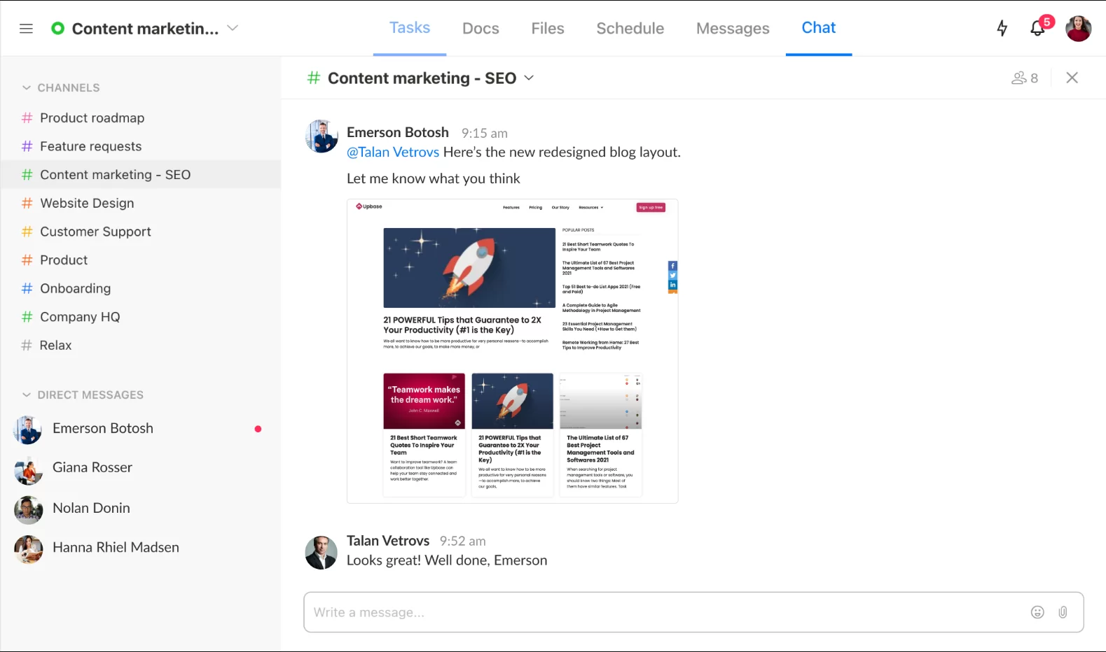
- Chat – a real-time chat tool for all members of a project.
Combined with other features like assignees, watchers, comments, and attachments, Upbase’s collaboration capability goes beyond Motion and Sunsama.
But don’t worry, you can show or hide any tool as wanted to keep the layout clutter-free.

So, whether for team collaboration or personal use, Upbase can flexibly meet specific needs with a clean, simple interface.
But don’t just take our word.
Sign up for a free Upbase account and test the app yourself.
